2024 |
[CLIENT] TechForce Group |
Global |
[BRAND IDENTITY] [LOGO DESIGN] [TYPEFACE DESIGN] [UX & UI DESIGN] [GRAPHIC DESIGN] [STATIONERY DESIGN] [BRAND GUIDELINES] |
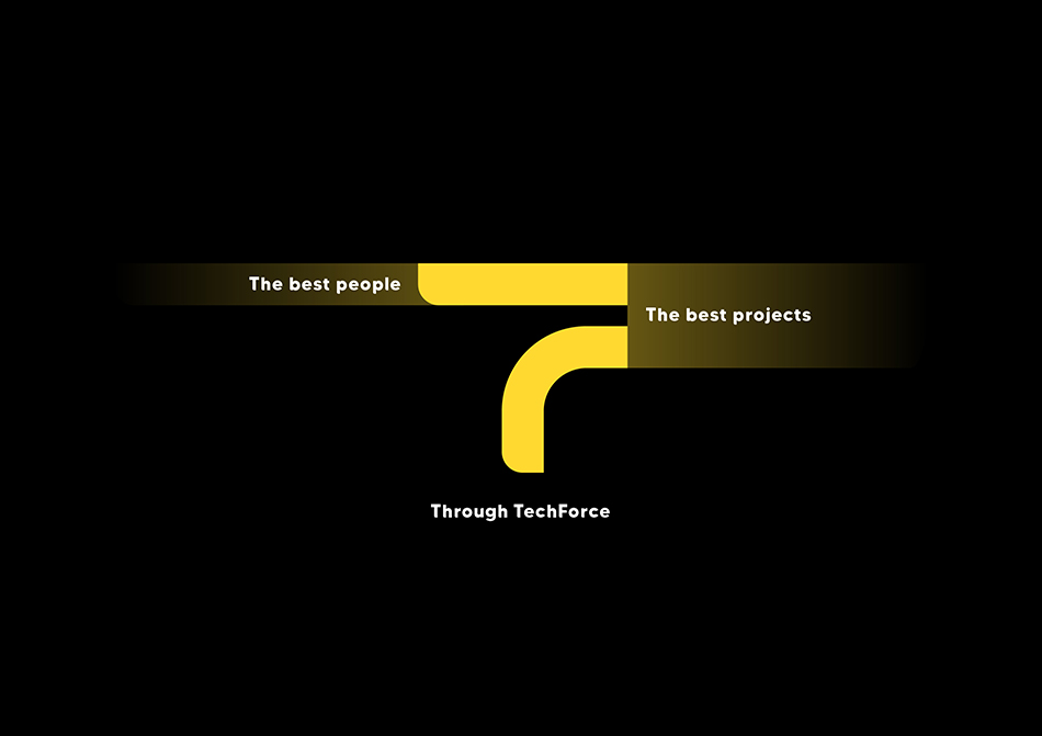
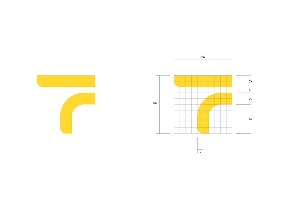
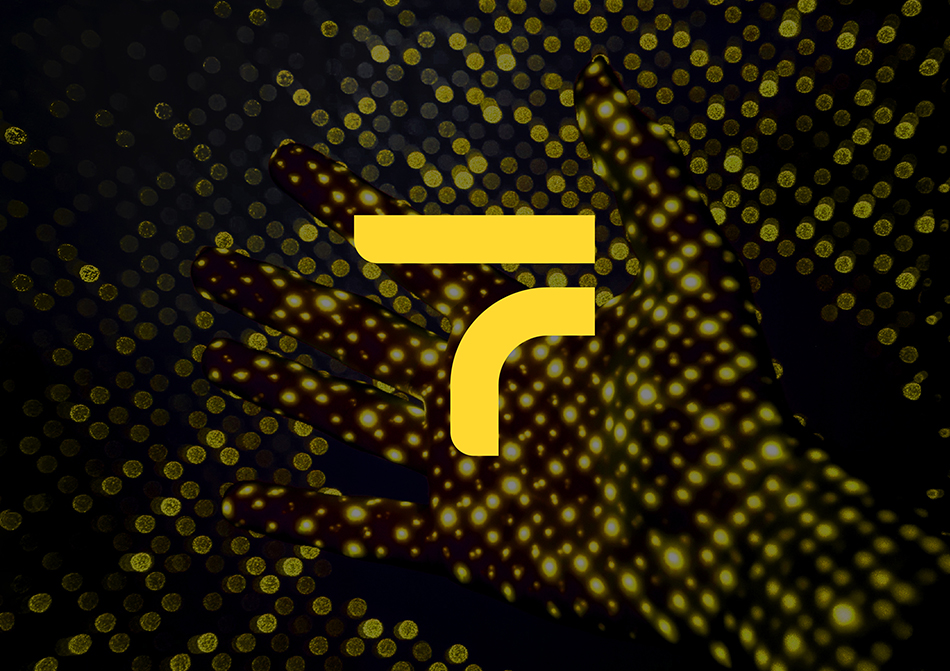
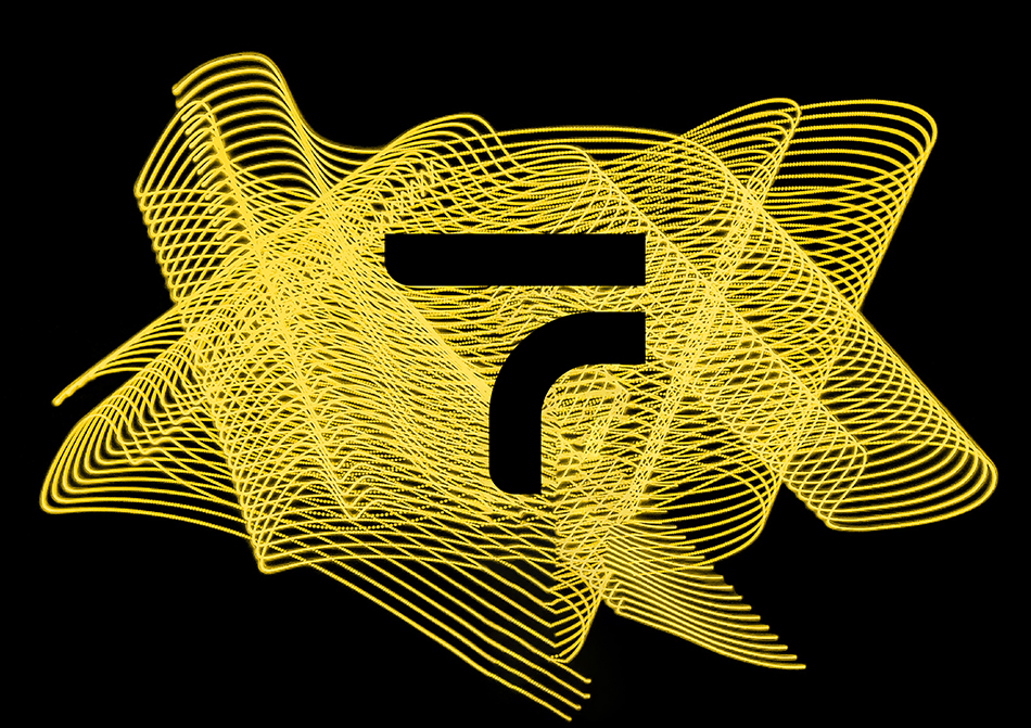
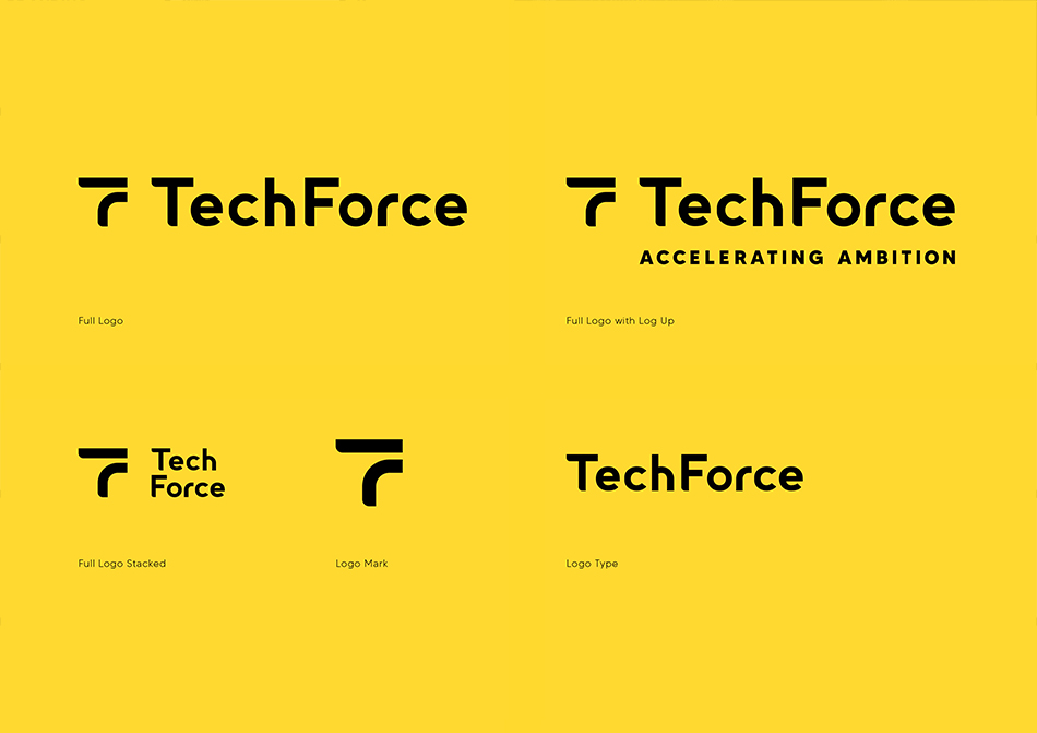
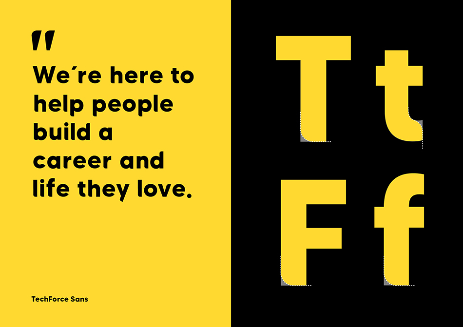
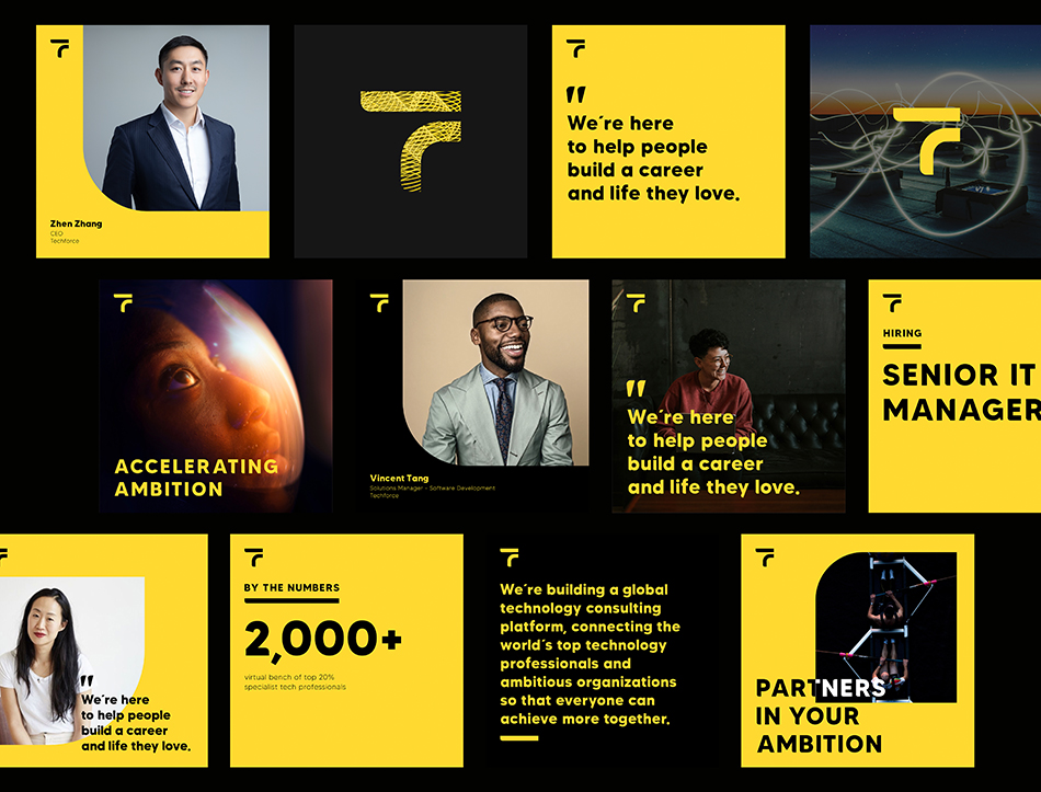
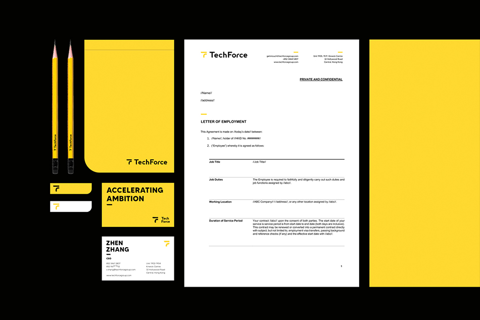
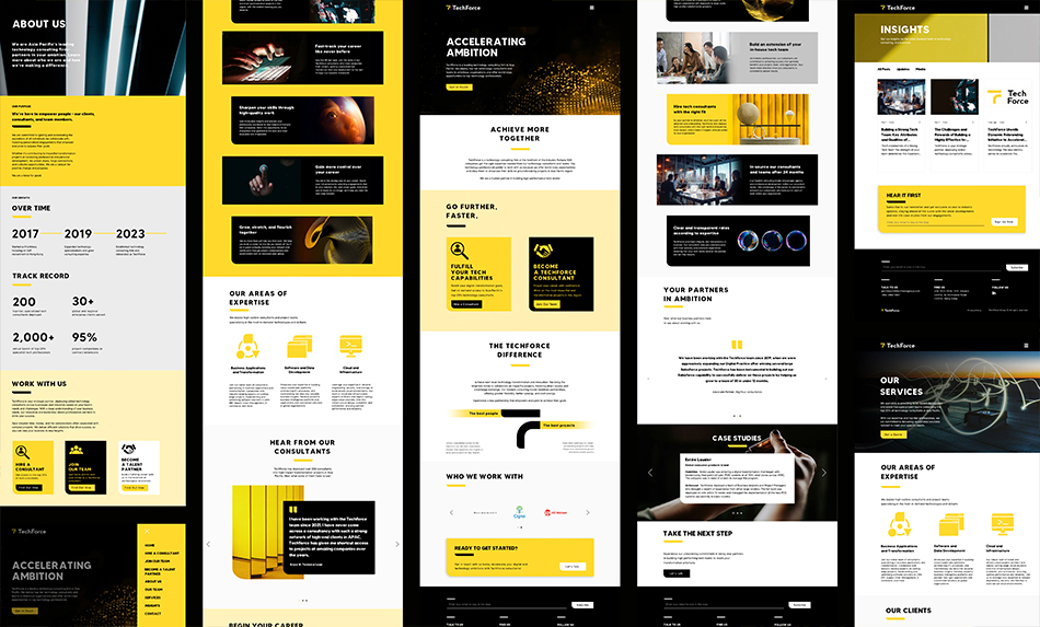
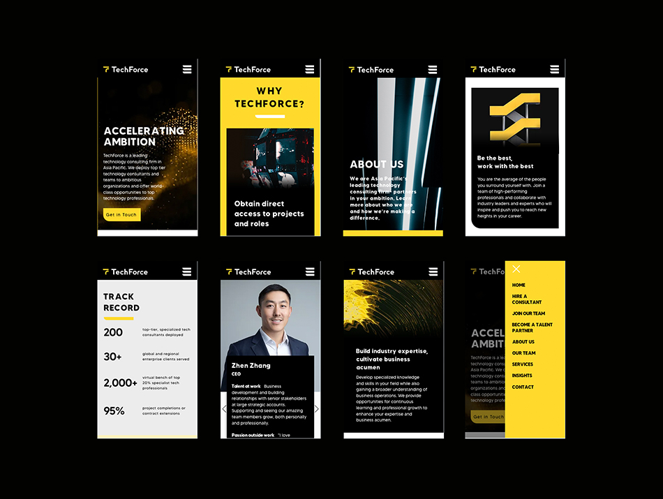
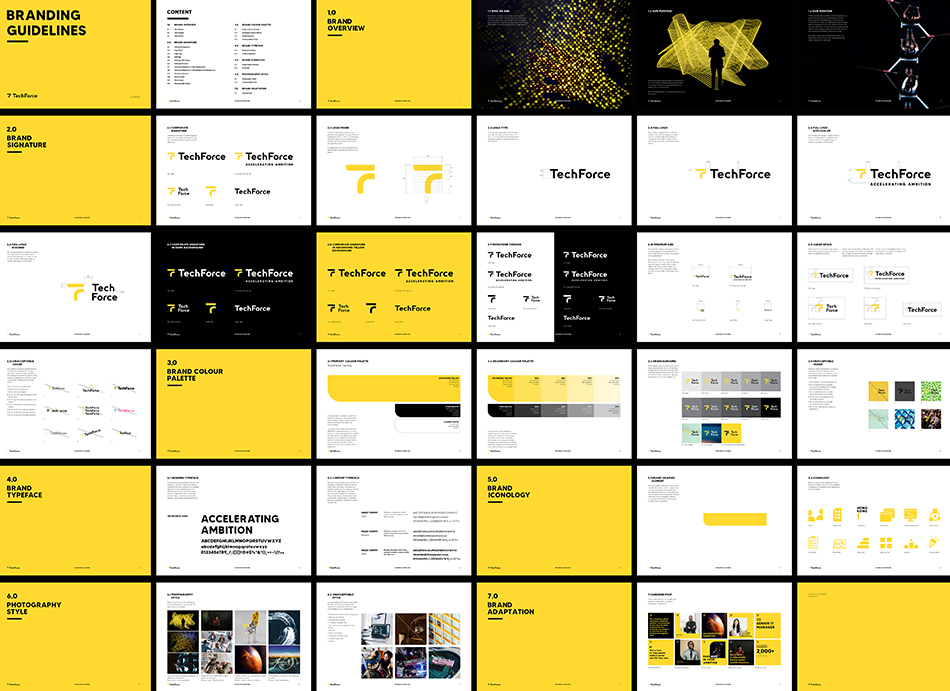
TechForce is a leading technology consulting firm in Asia Pacific. We helped them to recreate the brand identity to give a modern and fresh twist. We kept the black colour from the old branding and introduced an Advancing Yellow to the brand, giving an upbeat and exciting feeling. It can also stand out from other competitors. The logo design consists of two pathways emerging into the same direction, creating the initial "T" and "F" of TechForce. It mimics the motion of opening doors for clients and talents. It creates a confident and bold feeling to audiences. The custom-made fonttype include one rounded corner in each alphabets to unite with the logo design.
180
TechForce Rebranding
[The motion of opening doors]

TechForce Rebranding
[The motion of opening doors]