2024 |
[CLIENT] AnchorX |
Global |
[BRAND IDENTITY] [LOGO DESIGN] [KV DESIGN] [UX & UI DESIGN] [GRAPHIC DESIGN] [STATIONERY DESIGN] [BRAND GUIDELINES] |
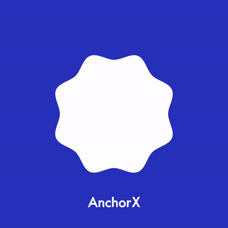
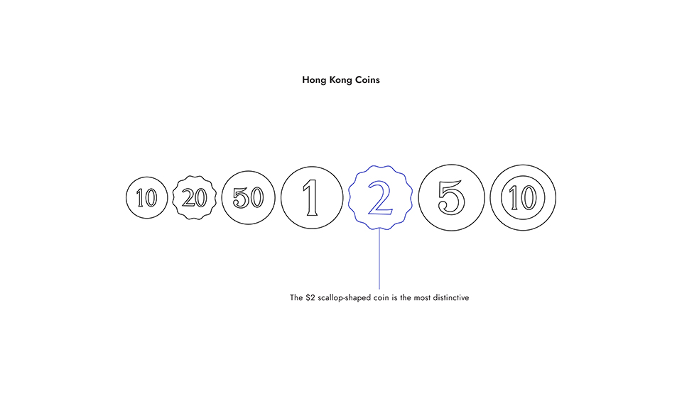
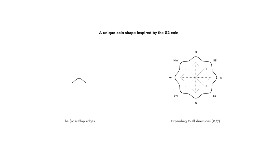
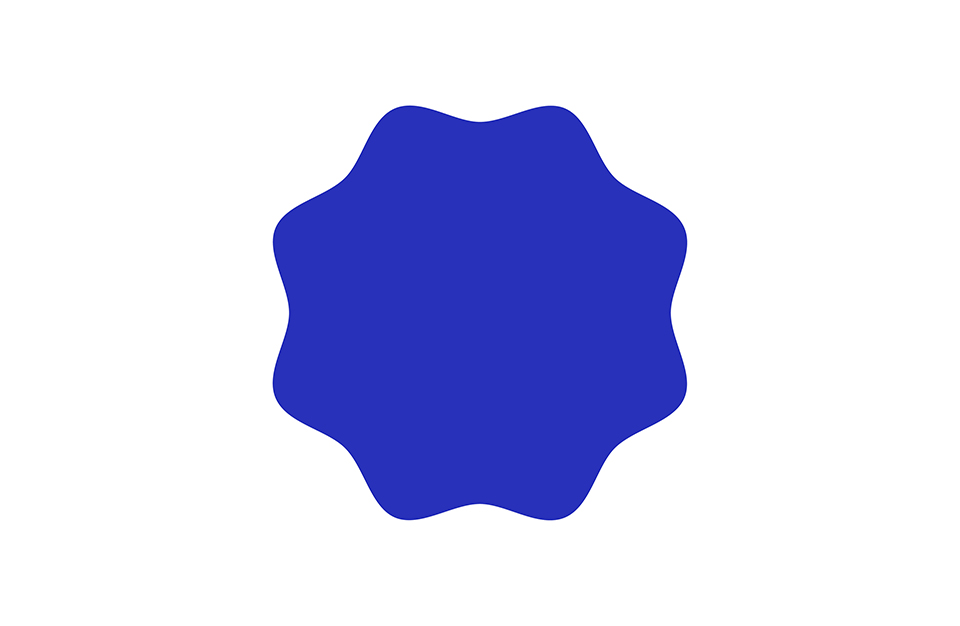
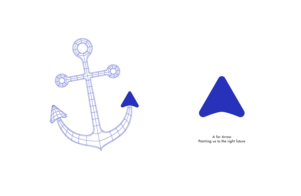
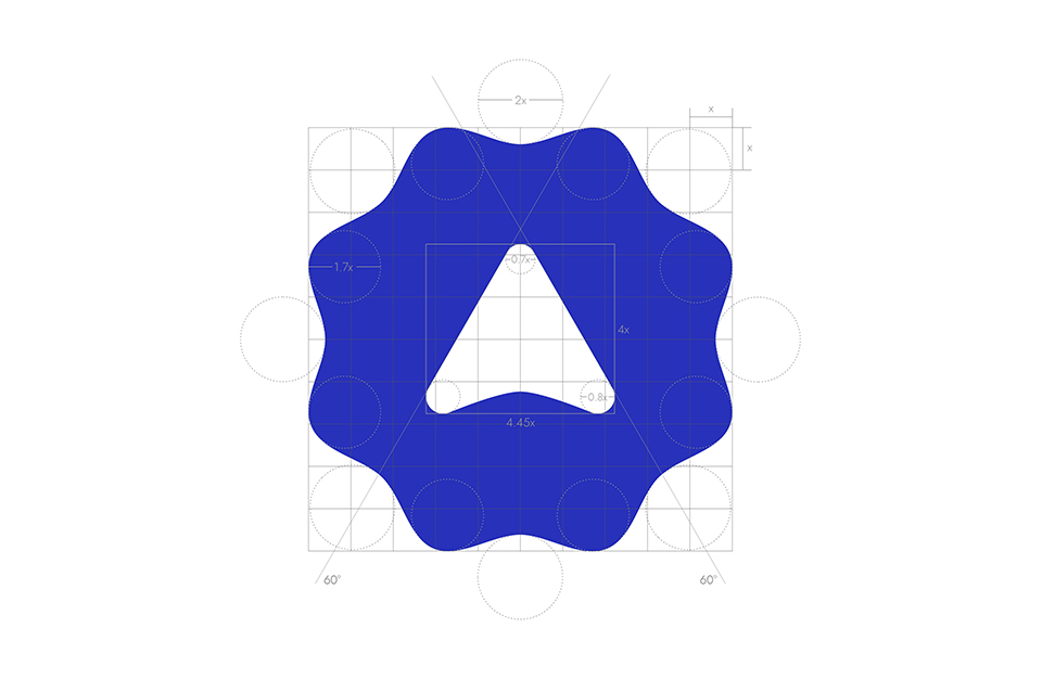
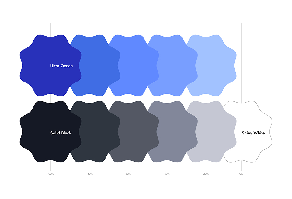
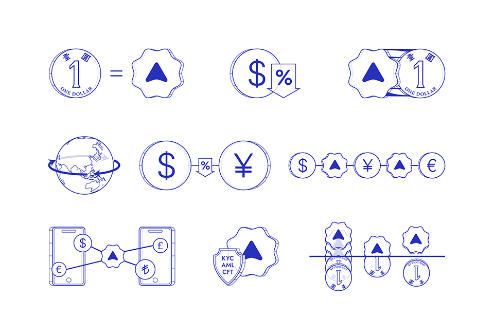
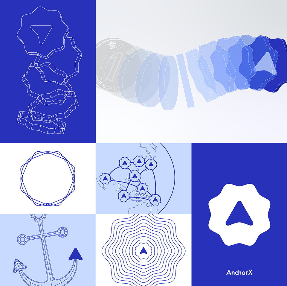
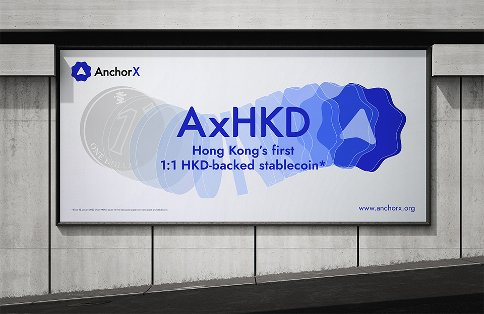
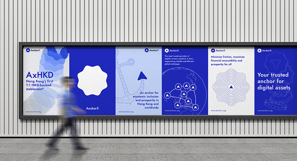
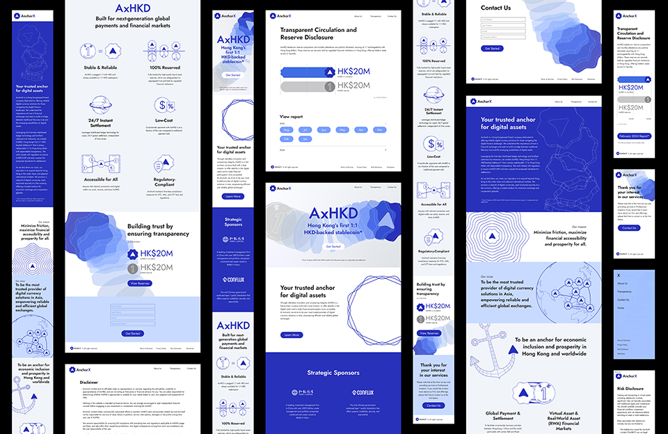
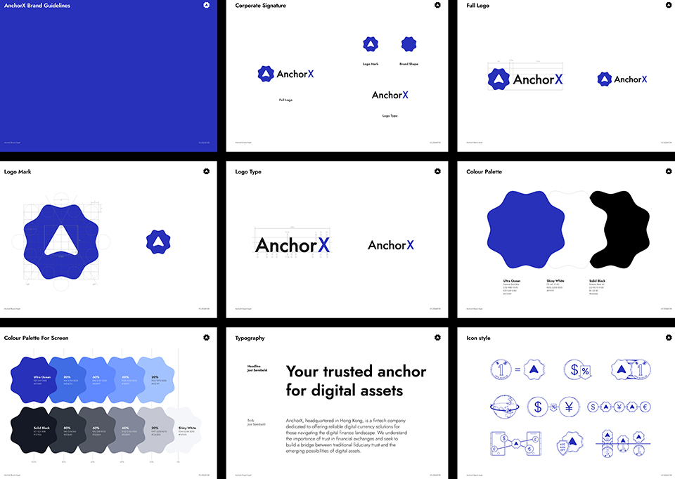
AnchorX is the first HKD-backed stablecoin company. The overall identity gives a professional, flexible and trustworthy feeling. Inspired by the distinctive scallop-shaped HK$2 coin, we created a unique shape for AnchorX stablecoin. We used the scallop edges that expands in eight directions, symbolising all-rounded accessibility. The arrow shape inside the logo mark is the tip of an anchor, representing the "A" of AnchorX, and also pointing people to the right future. The Ultra Blue colour gives a active and modern feeling. We used thin line and wireframe graphic style to project an accurate and serioues feeling. The key visual illustrated a seamless transformation from a HK$1 coin to an AnchorX stablecoin. It is easy to understand even for people who are not in finance expertise.
178
AnchorX Branding
[From a coin to a coin]
AnchorX Branding
[From a coin to a coin]