2024 |
[CLIENT] KIO |
Hong Kong |
[BRAND IDENTITY] [BRAND NAMING] [LOGO DESIGN] [BRAND STRATEGY] [PACKAGING DESIGN] [GRAPHIC DESIGN] [ILLUSTRATION] |
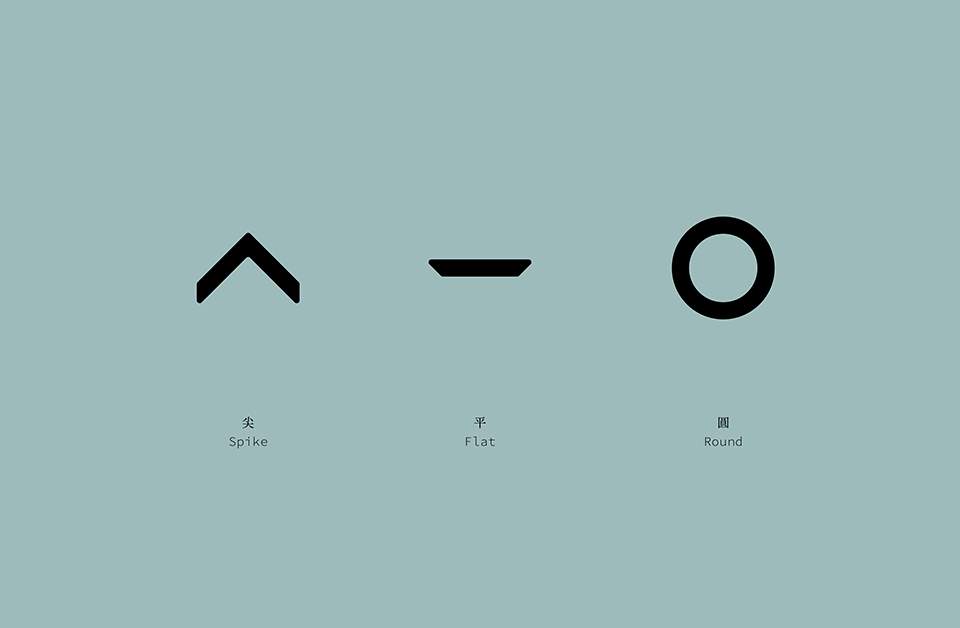
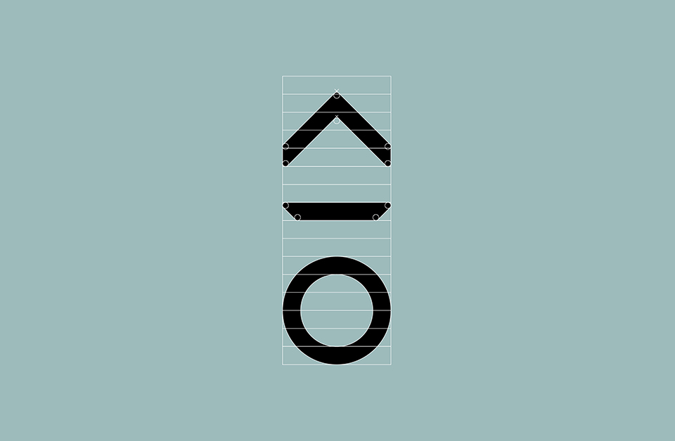
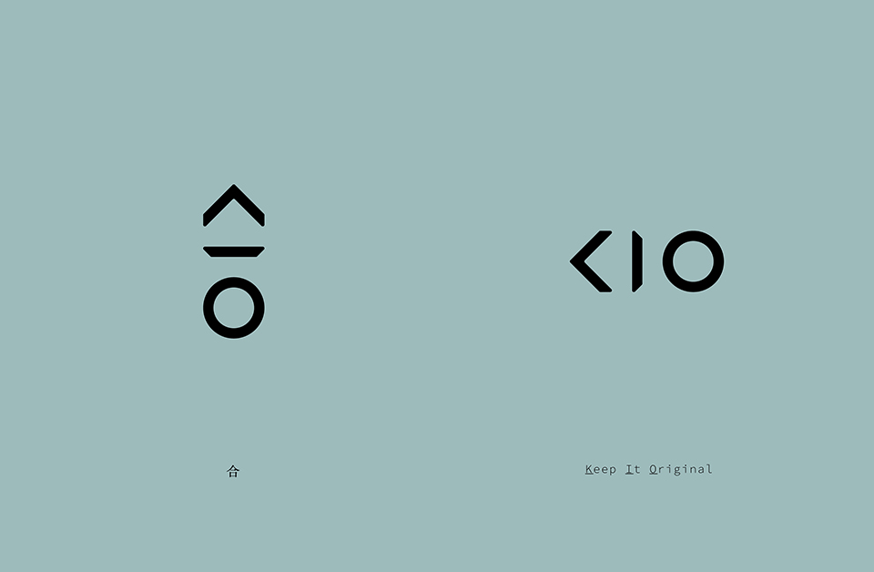
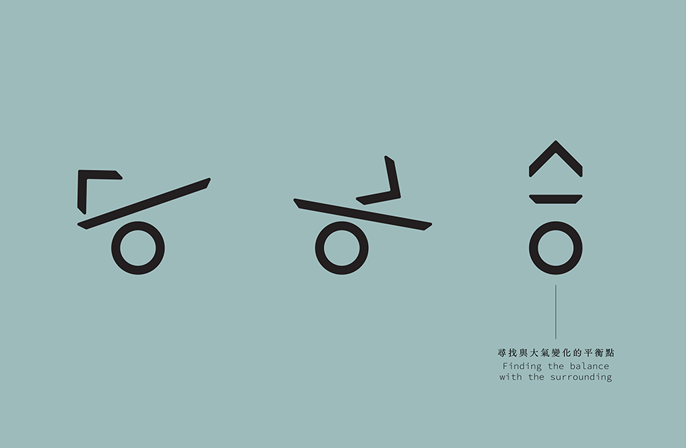
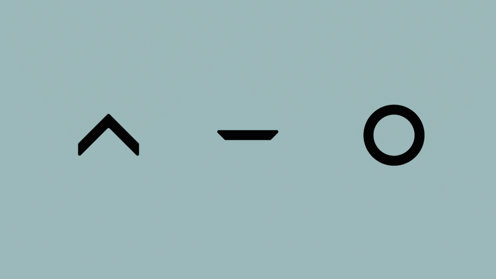
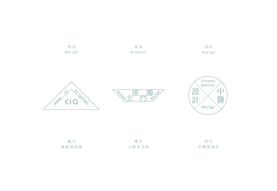
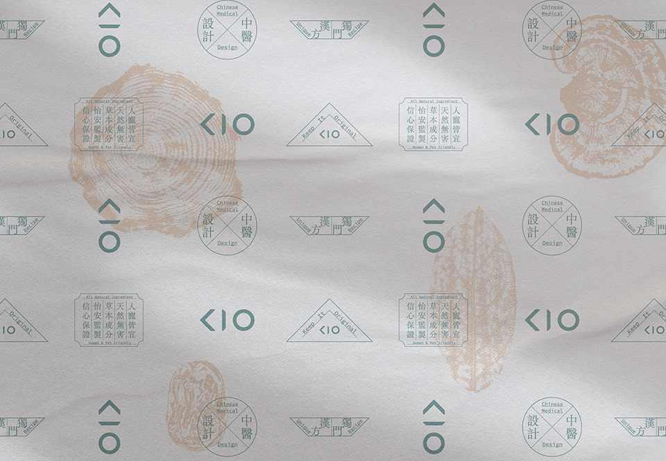
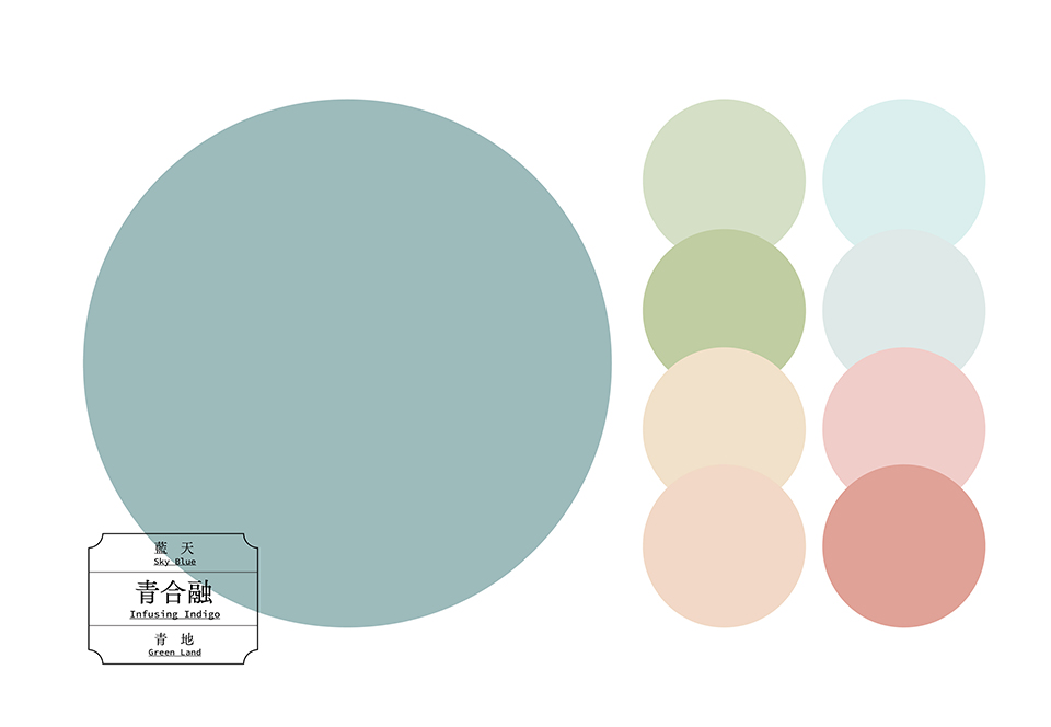
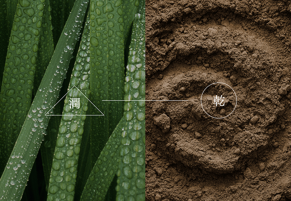
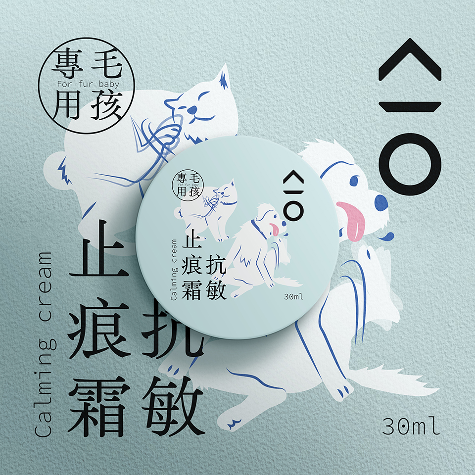
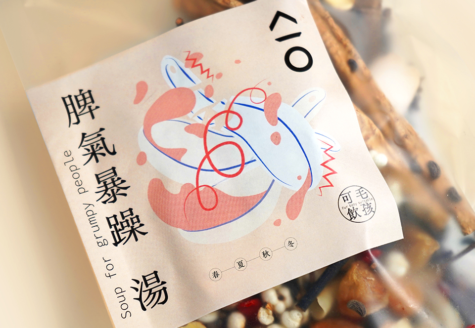
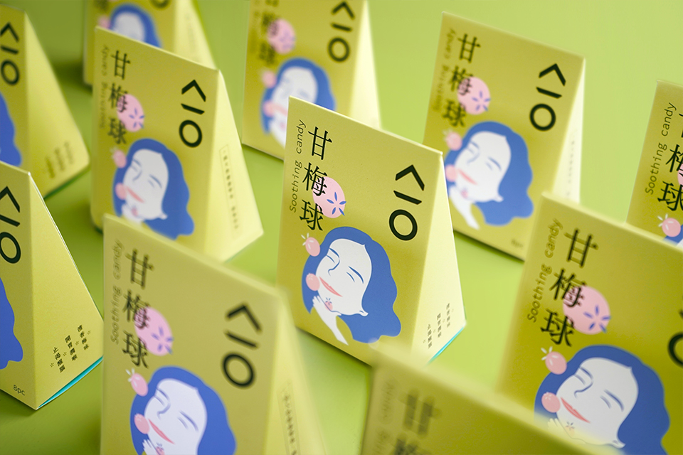
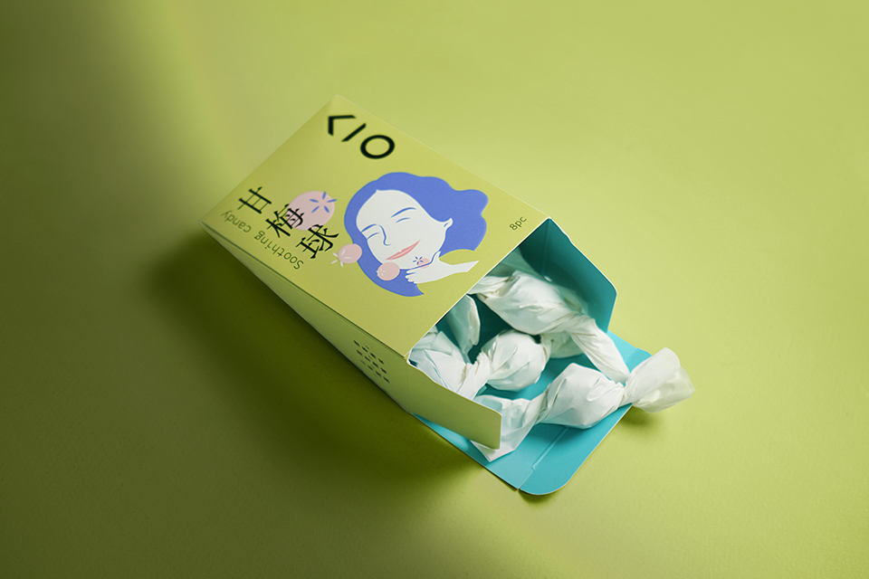
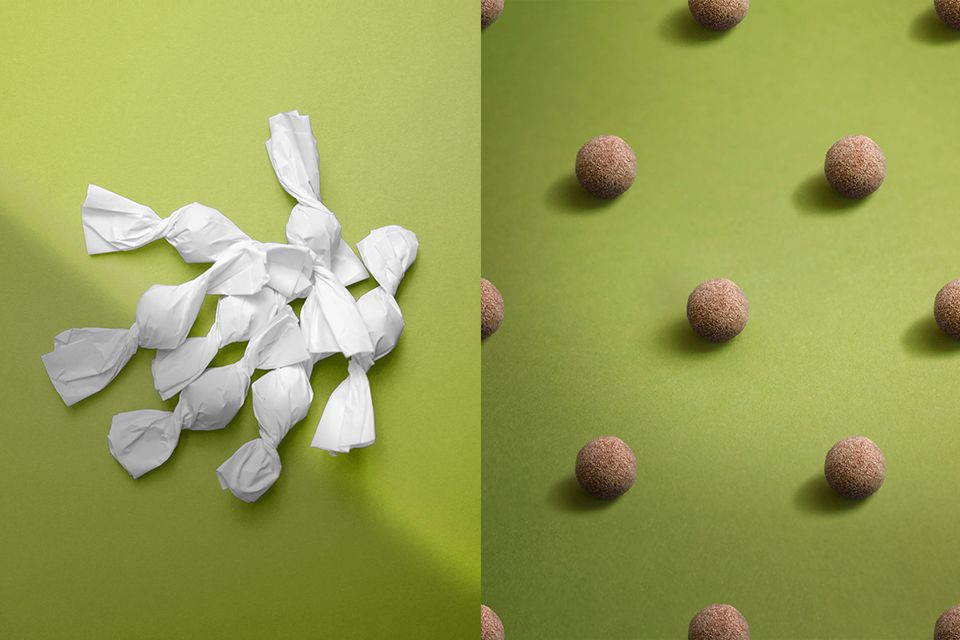
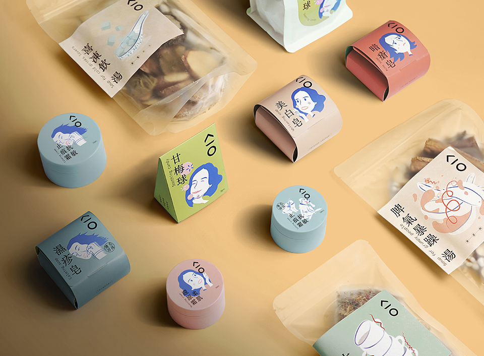
KIO, “合”, is a wellness brand that provides Chinese Medical products for health and skincare. The Chinese name draws inspiration from the core principles of traditional Chinese medicine, Yin and Yang. When Yin and Yang are perfectly balanced, everything is in its most harmonious state. KIO does not advocate for strict diets to maintain health, but rather encourages consuming the right foods to address ailments, such as pairing ginger with sushi to counteract coldness. The logo design deconstructs the Chinese name. Spike (尖), flat (平) and round (圓) shapes are the three elements underlying the formation of nature and all living beings. When the three elements are in perfect balance, the word "合" is formed. Horizontally, the English name "KIO" appears, representing "Keep It Original." The Infusing Indigo brand colour is the merge of the blue sky and the green land, representing the mixing and harmony concept of the brand. Understanding traditional Chinese medical theory can be challenging for the general public. Many of us struggle with understanding the terms and categories, making it difficult for us to select suitable wellness products. When designing the products and the packaging, we revisited the intricate Chinese medical theory and simplified product names based on various imbalance symptoms. Through dynamic and metaphorical illustrations that visualise these symptoms, individuals can easily find products tailored to their needs.
181
KIO Branding
[The art of balance]

KIO Branding
[The art of balance]