2022 |
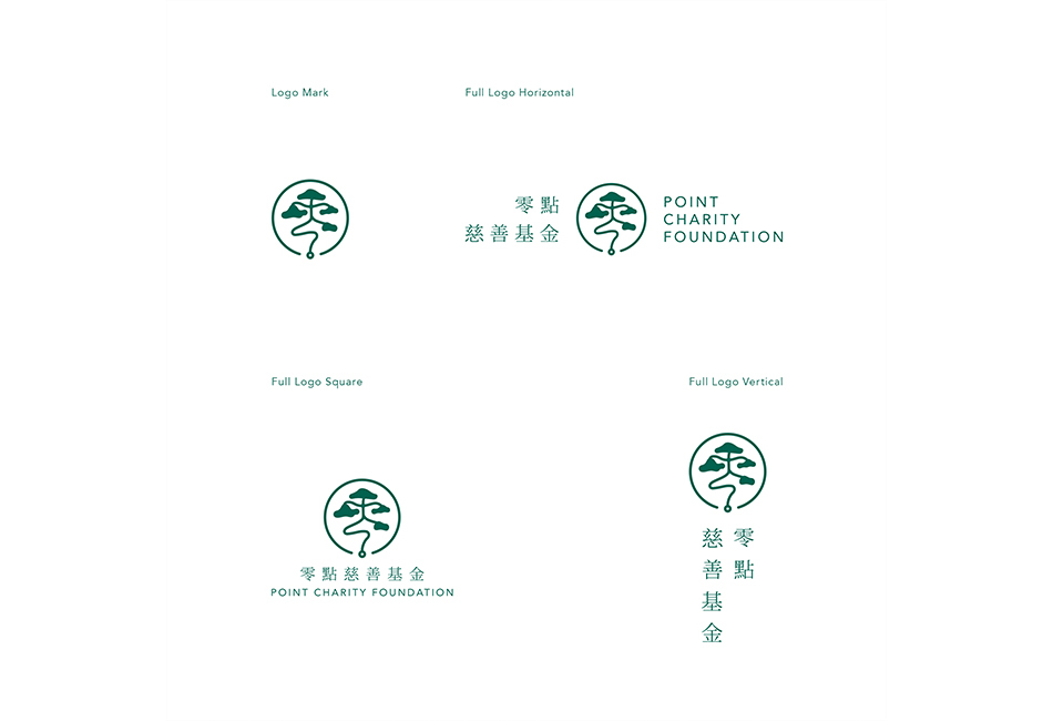
[CLIENT] Point Charity Foundation (PCF) 零點慈善基金 |
Hong Kong |
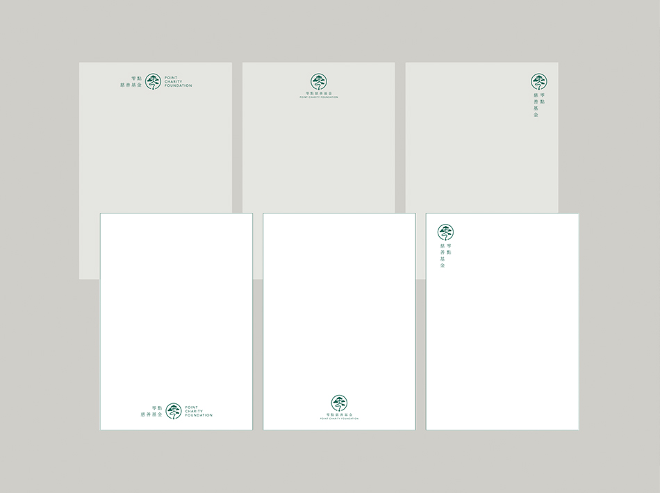
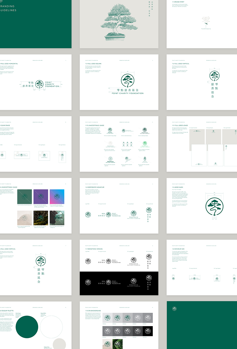
[CORPORATE IDENTITY] [LOGO DESIGN] [BRANDING GUIDELINES] |
[AWARDS]
International Design Awards, 2022 — Honourable Mention in Graphic Design, Print-Corporate Identity — Honourable Mention in Graphic Design, Print-Logos, Trademarks And Symbols 
|
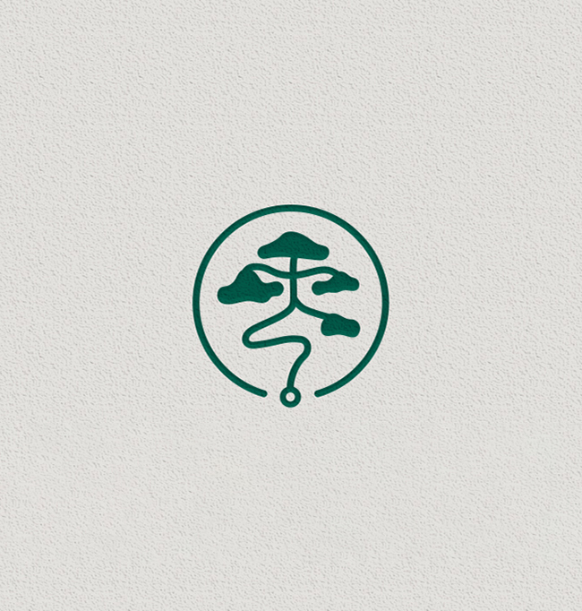
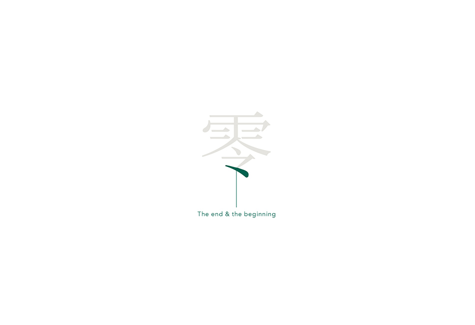
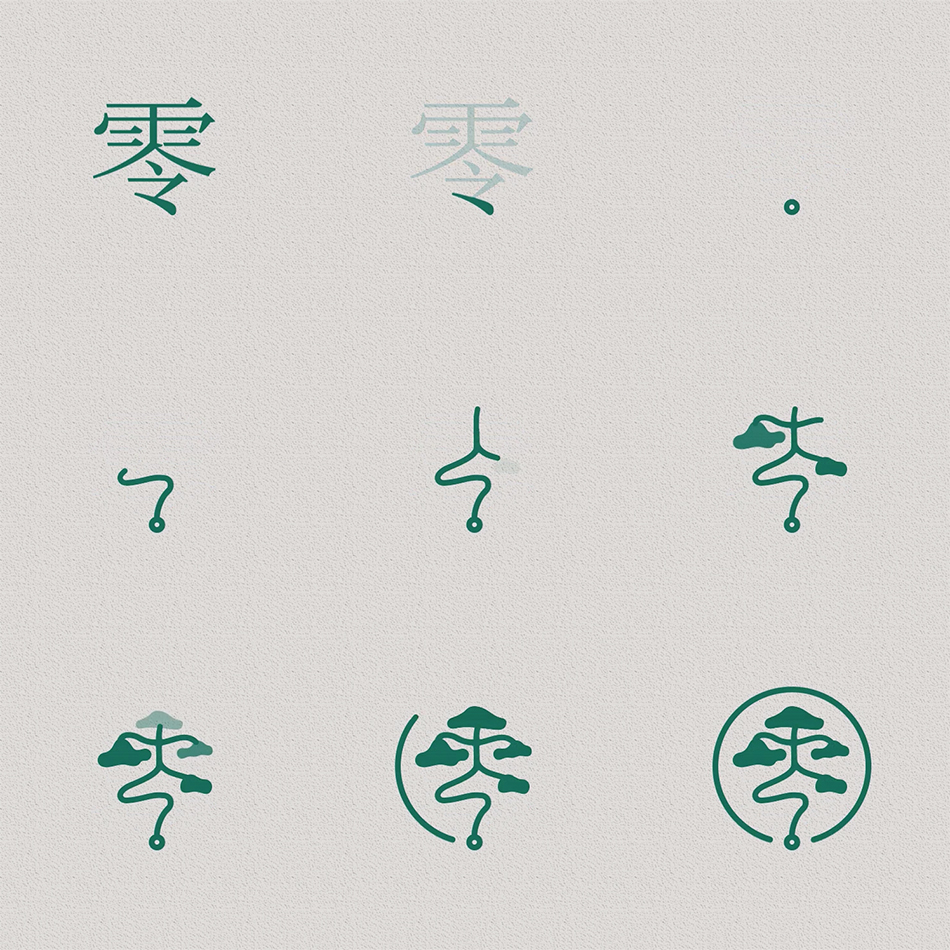
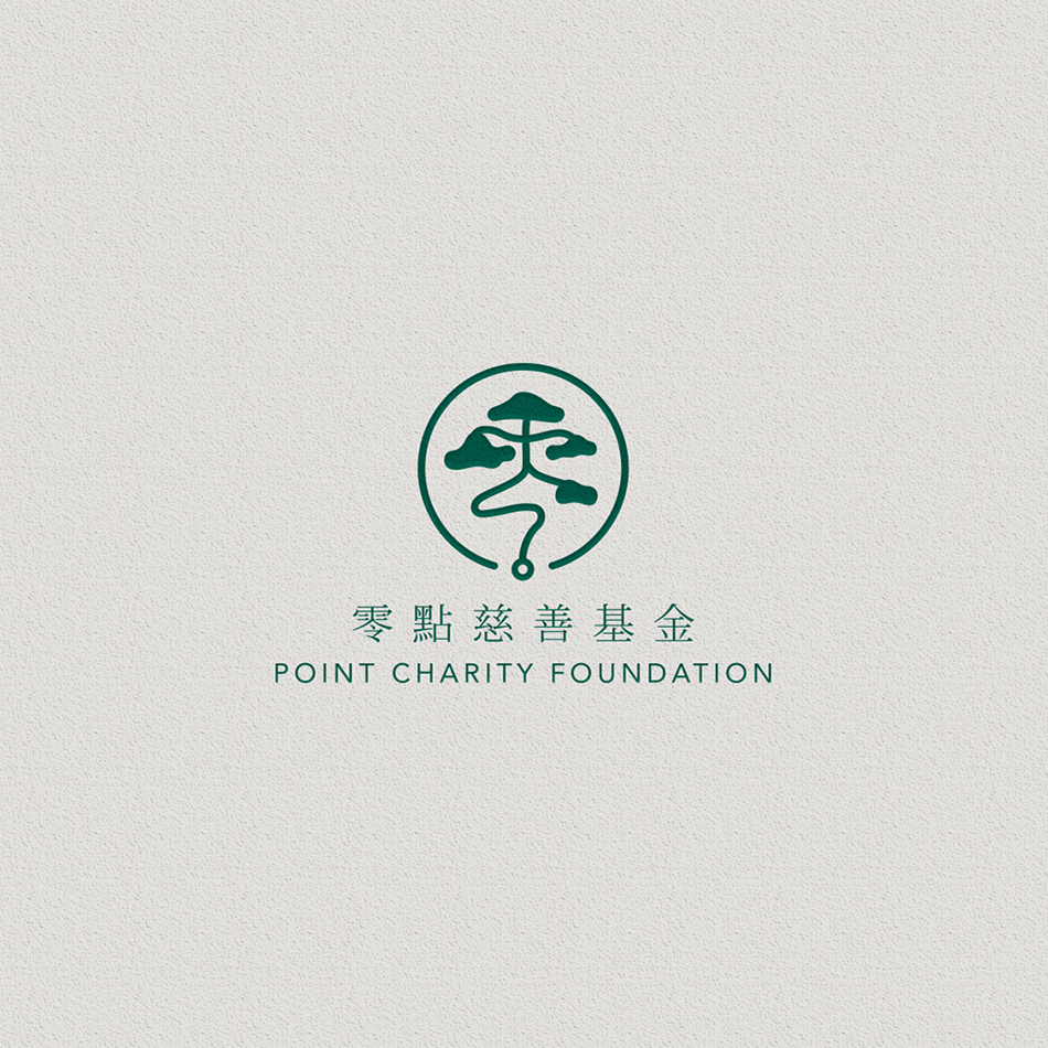
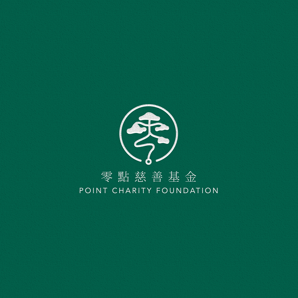
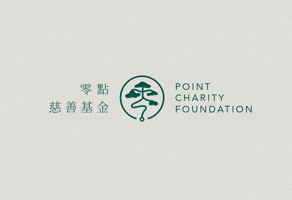
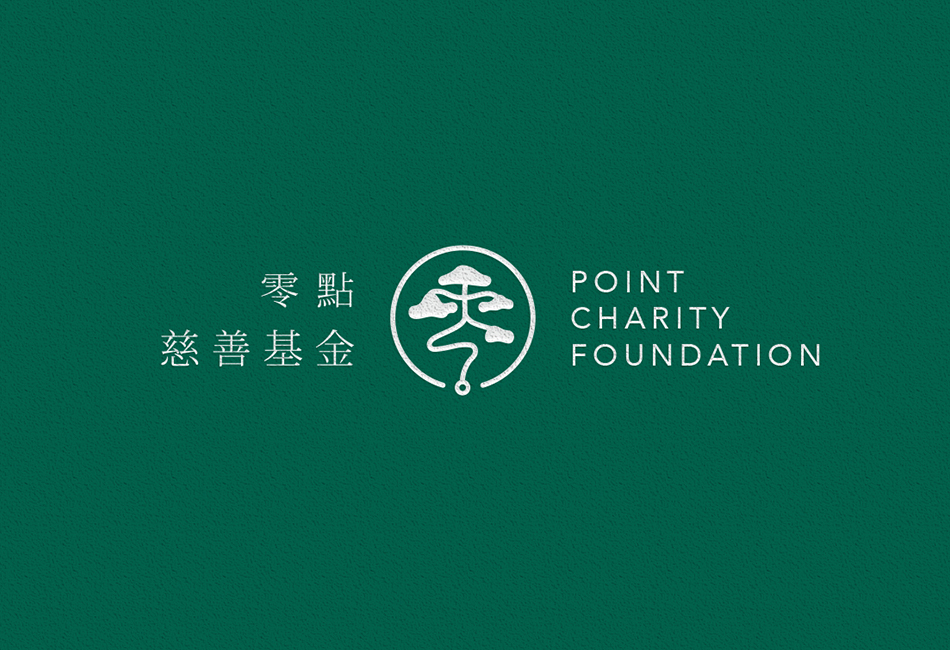
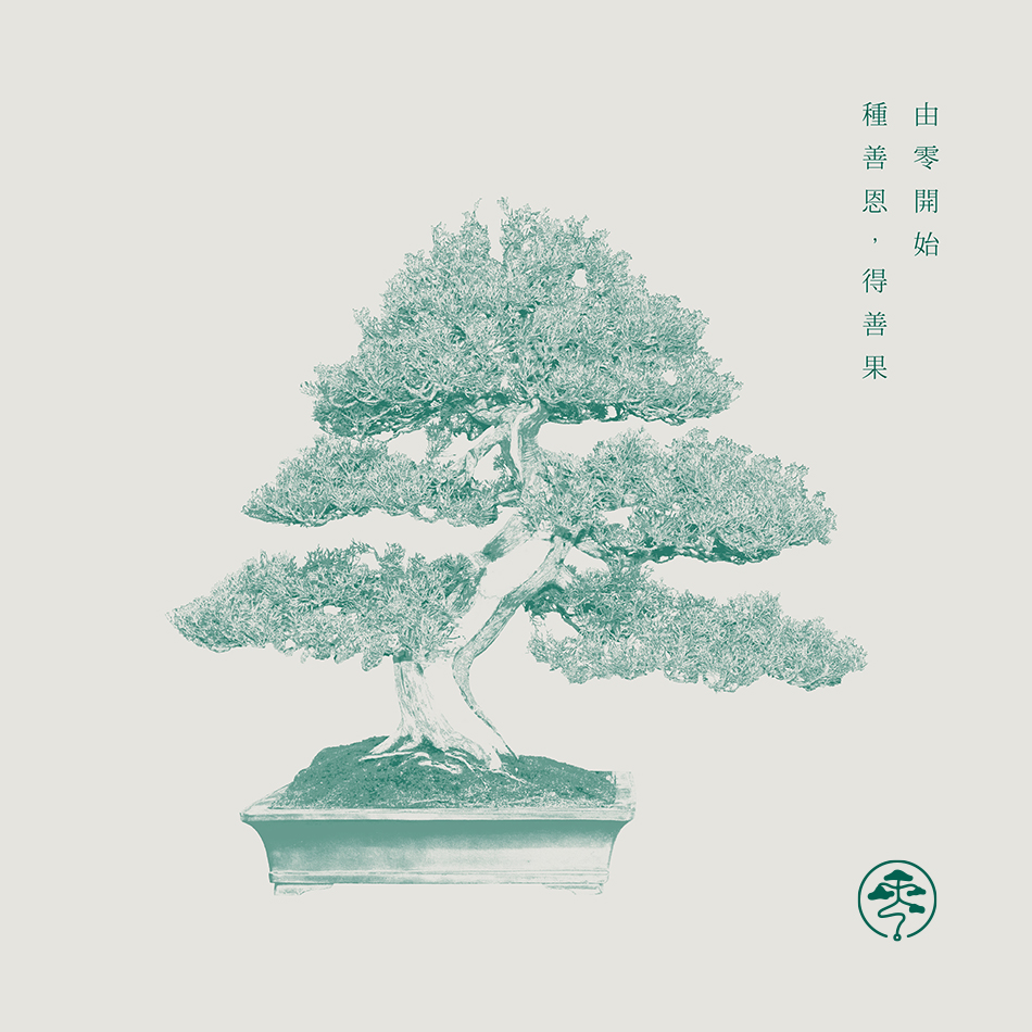
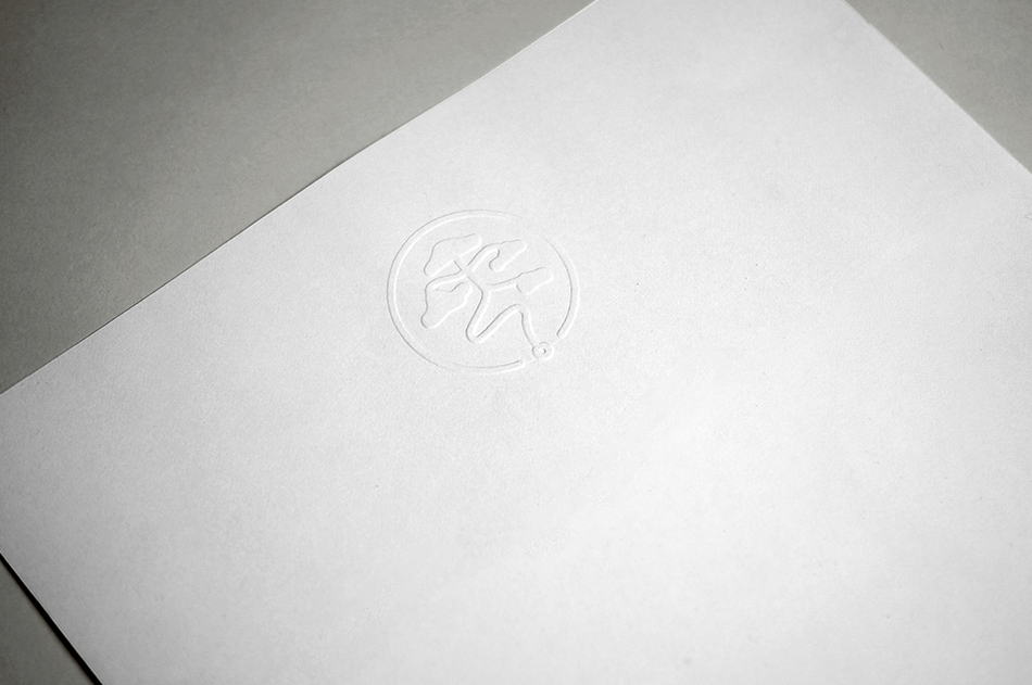
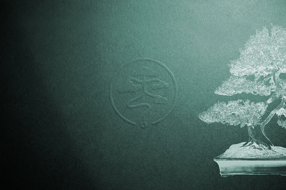
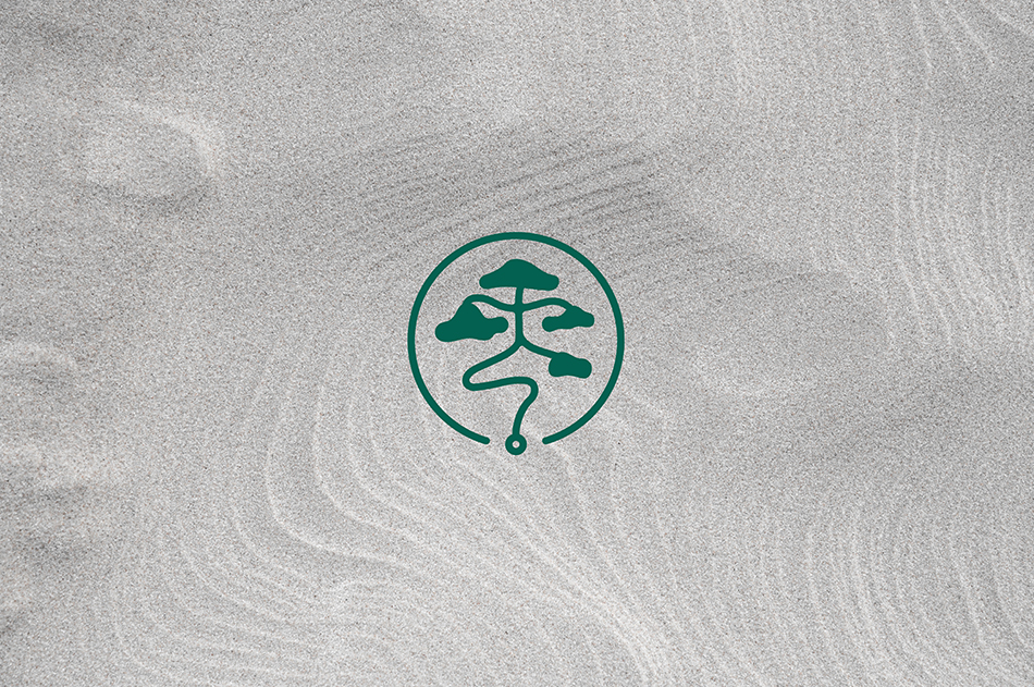
From “Point” To “World”
由零開始 終歸為零 以點留存 匯聚善點 潤澤萬物 Life and death is a continuous and infinite loop. It all started from the final “dot 點”, of the character, “Point 零”, for all matters. It act as a pot of a plant (the origin). Branches (the effort) grow taller and taller. Leaves (the result) started to blossom, forming a full grown bonsai tree. It is then doing good and impacting the surrounding (the world). The logo symbolised nurturing and doing good to the ecosystem of life and planet. We pick the Vital Green and Bone White for the brand colours, with the supplementary colour, Empty Grey, creating a mature and zen feeling to the brand.
157
Point Charity Foundation
Branding
[Start is end, end is start]

Point Charity Foundation
Branding
[Start is end, end is start]