2024 |
[CLIENT] OUI Workshop |
Hong Kong |
[REBRANDING] [BRAND IDENTITY] [LOGO DESIGN] [KV DESIGN] |
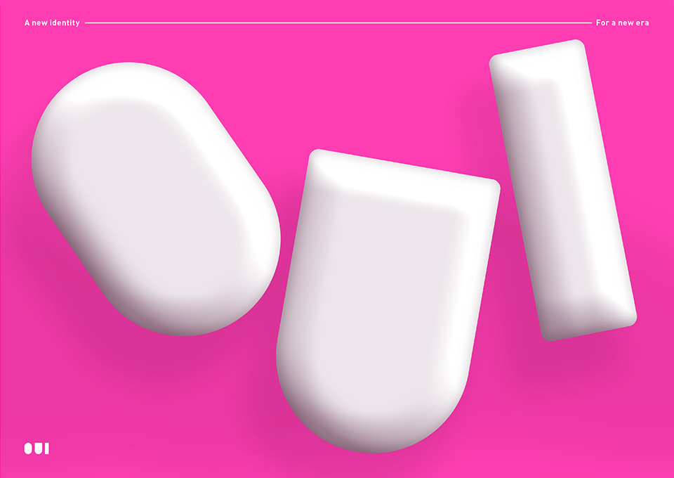
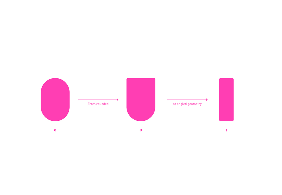
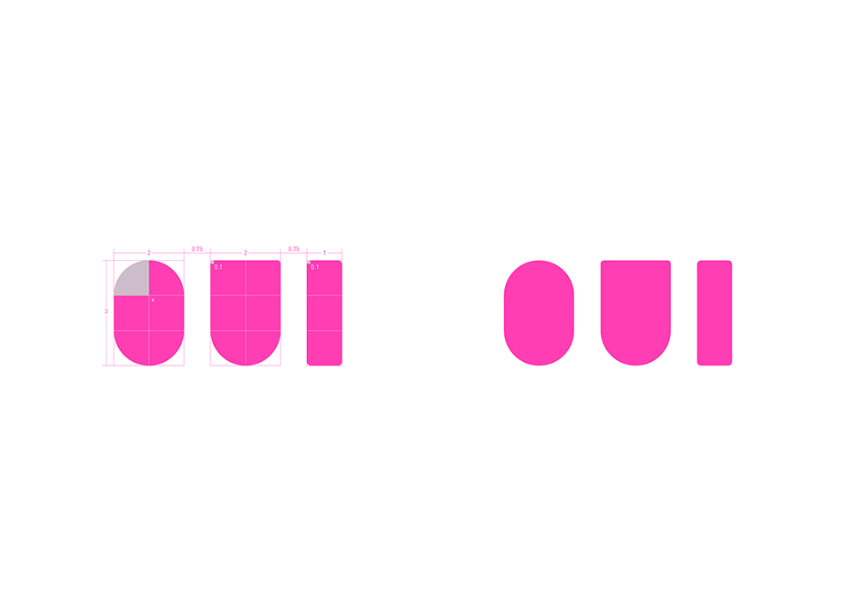
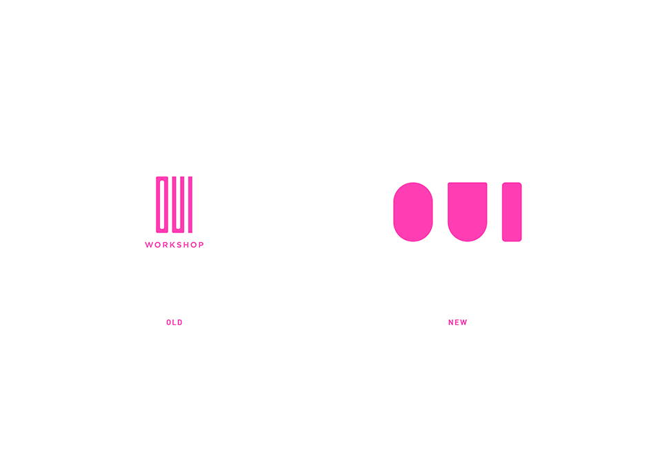
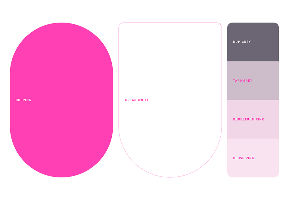
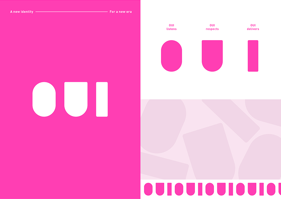
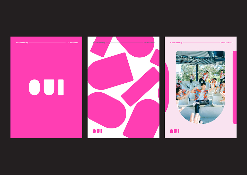
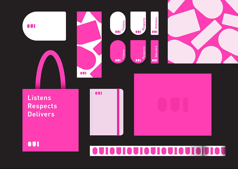
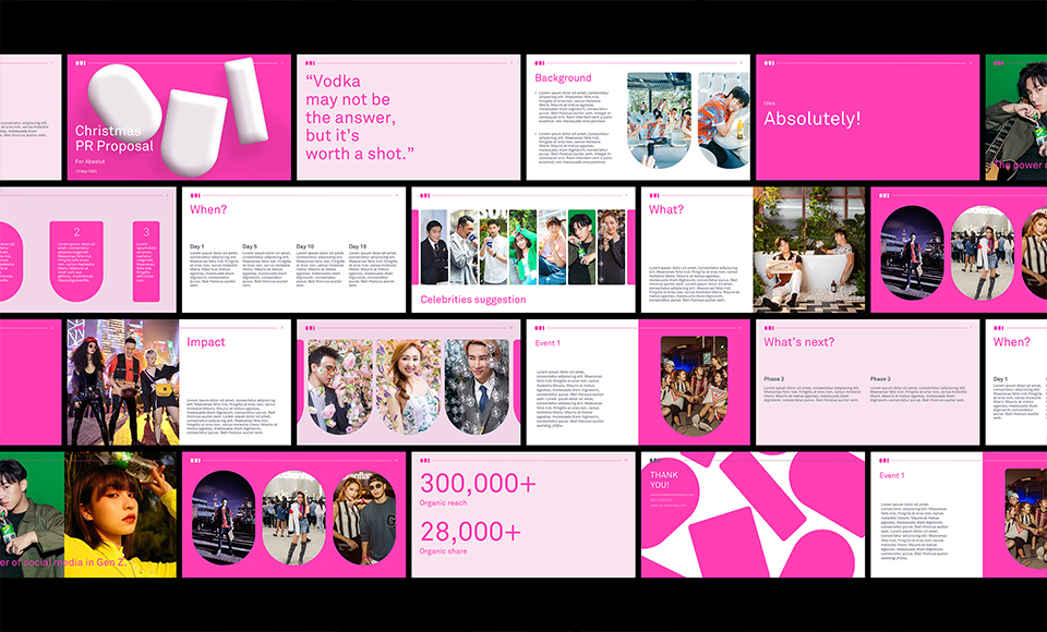
OUI is an event and PR agency in Hong Kong. “O”, “U” and “I” are in three different shapes from rounded to angled geometry, representing the diverse scope of work. When they put together, the logo represents a seamless bridge between client and the market. The new identity keeps the identical pink colour from the old one, yet transformed the brand into more modern, sharp and bold feeling. The cleanliness and simplicity added a smart element to the brand. A new set of supplementary colours are selected to support the Oui Pink colour, giving a feminine touch.
174
OUI
Rebranding
[A seamless bridge]

OUI
Rebranding
[A seamless bridge]