2020 |
[CLIENT] Hong Kong Red Cross |
Hong Kong |
[BOOK DESIGN] [LAYOUT DESIGN] |
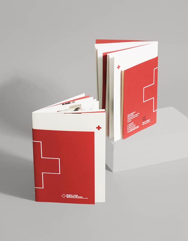
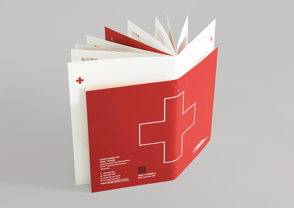
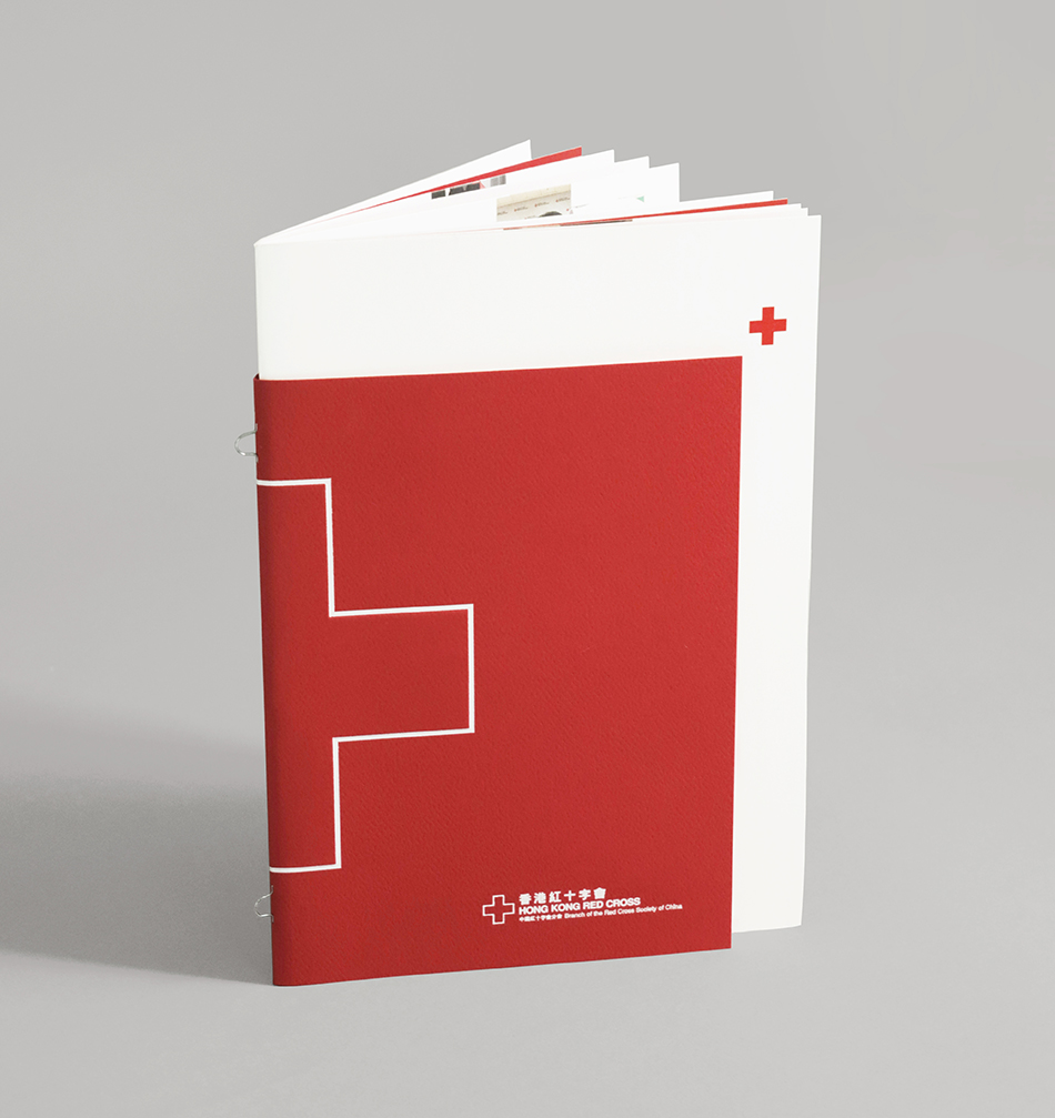
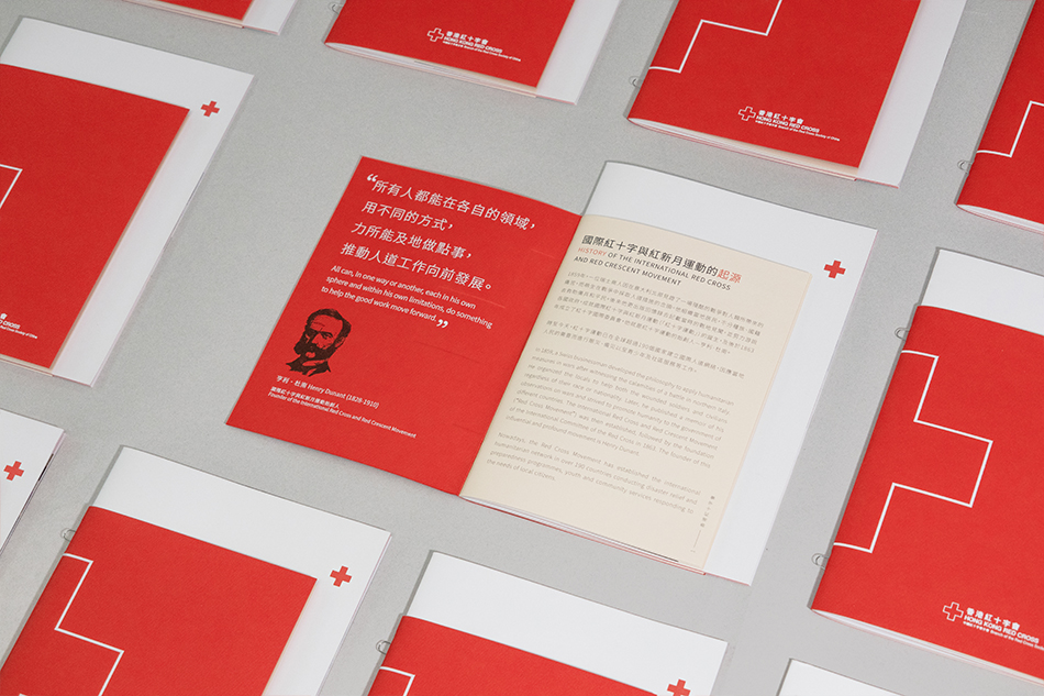
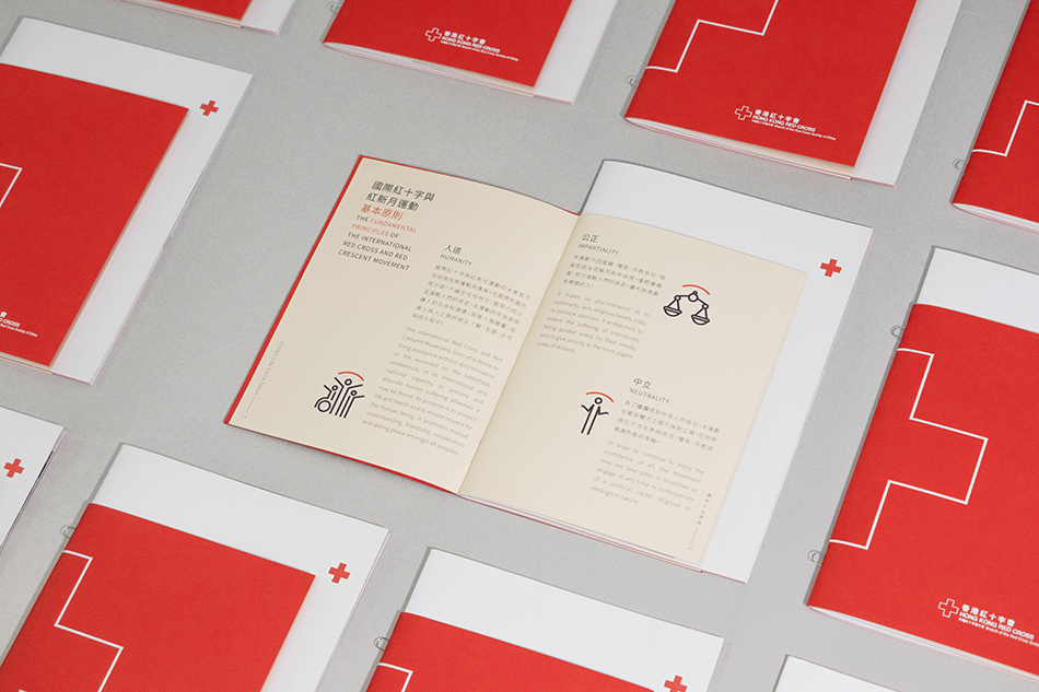
Hong Kong Red Cross was preparing a corporate brochure to introduce their mission and services. We helped them to create a handy booklet to visualise their information.
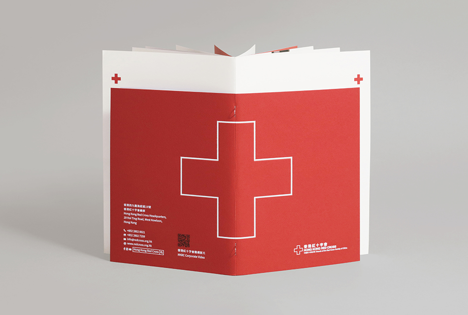
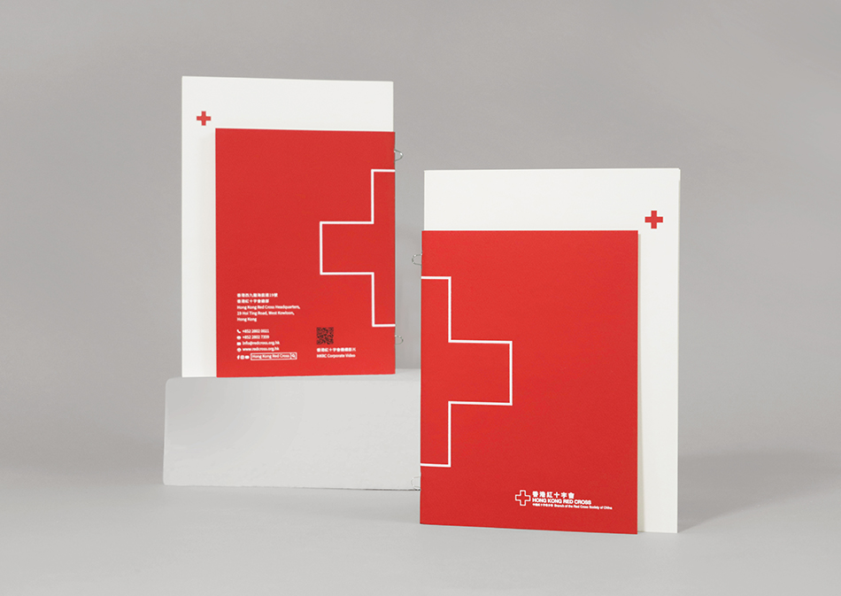
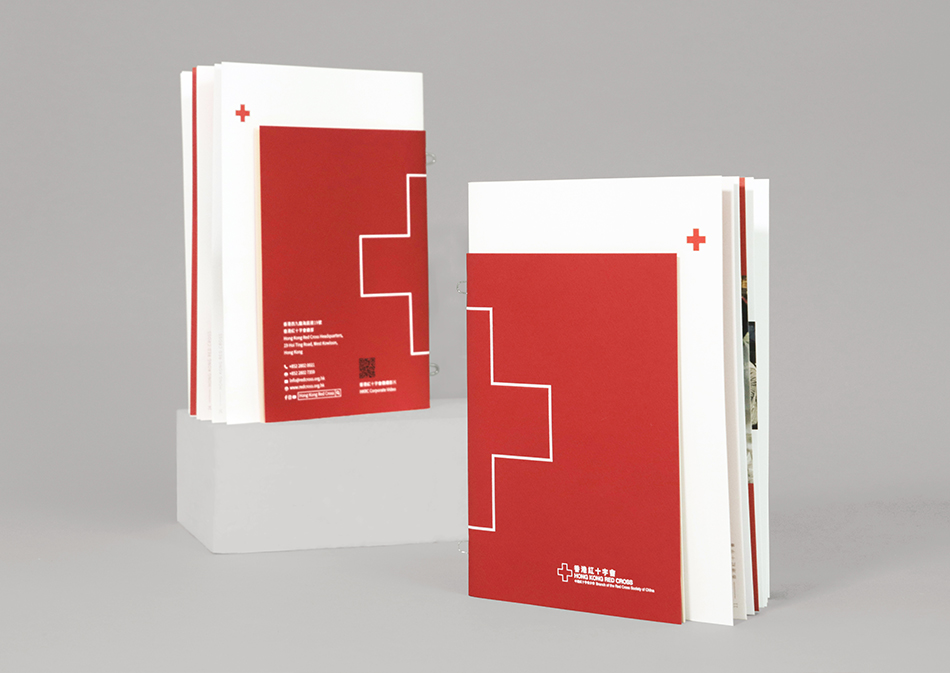
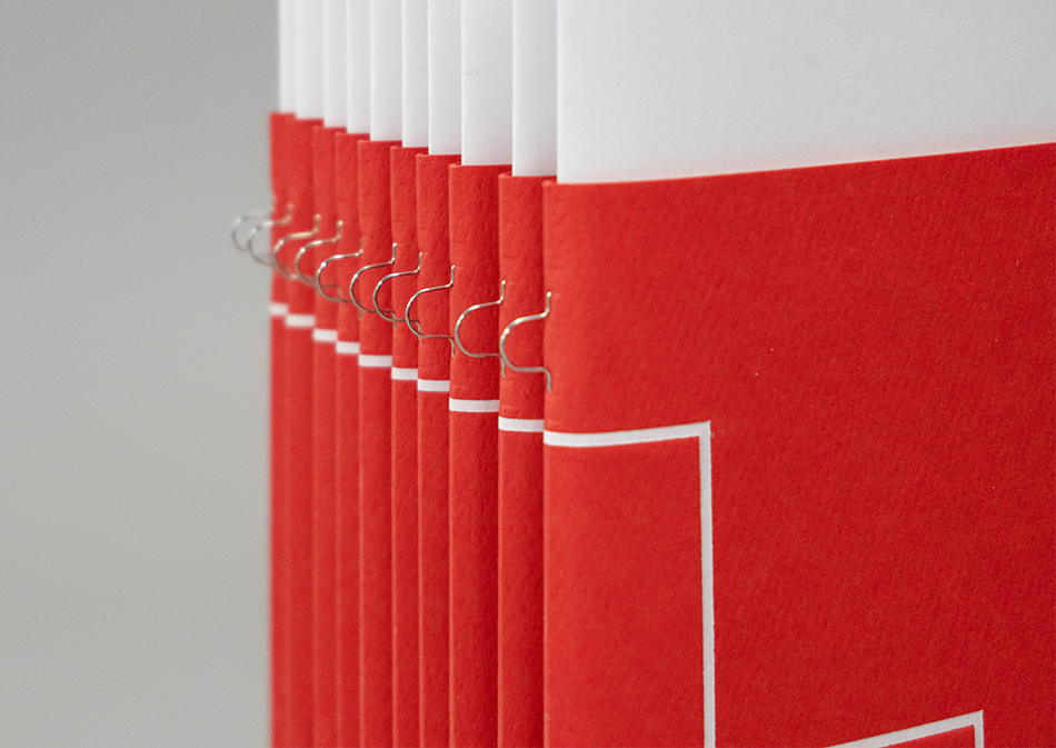
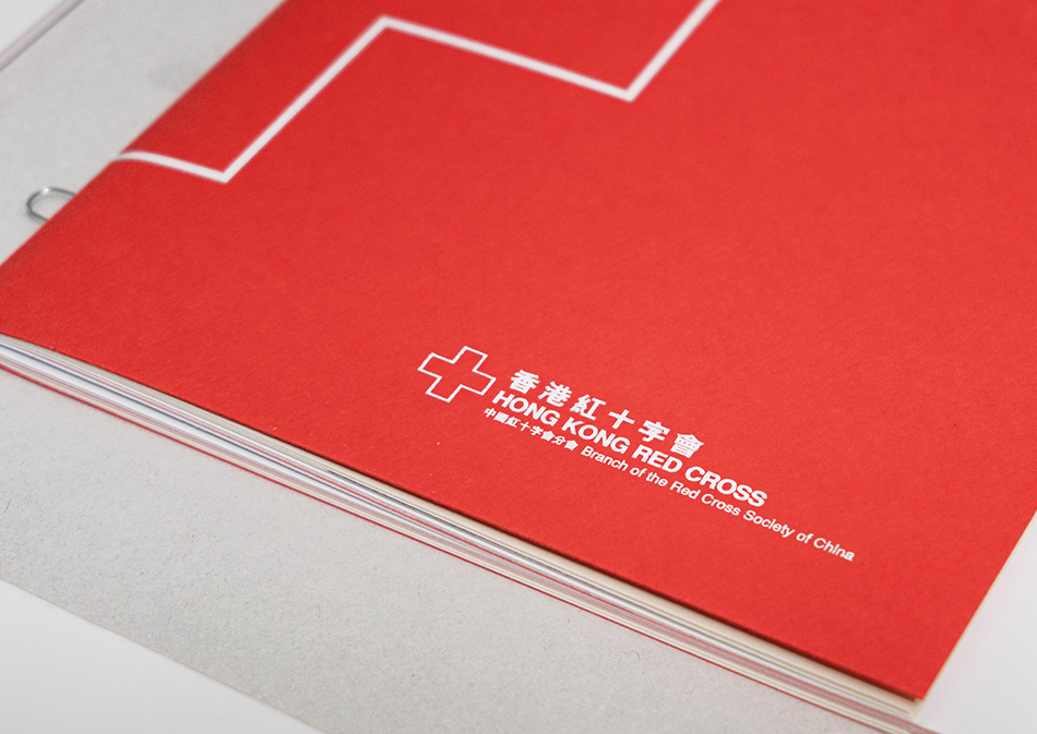
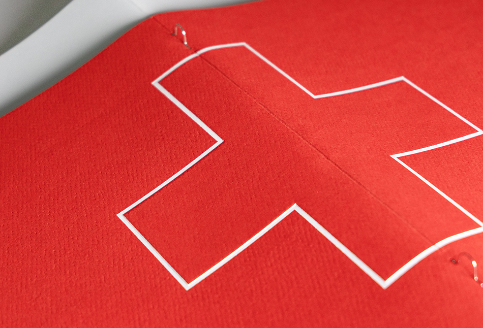
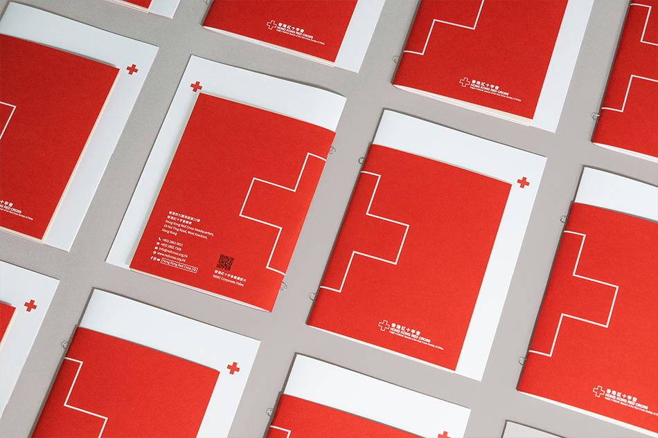
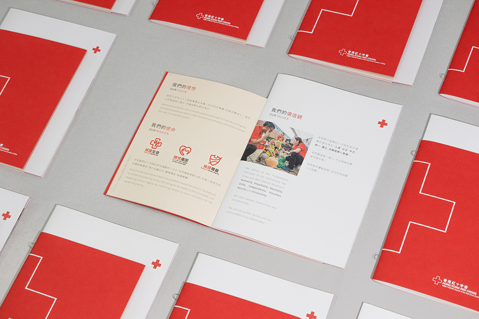
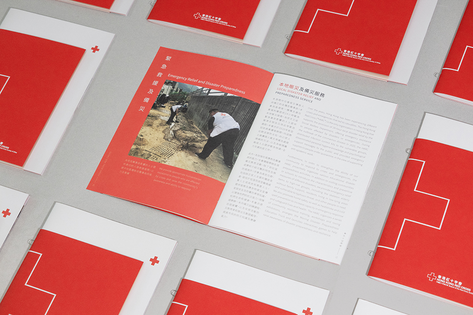
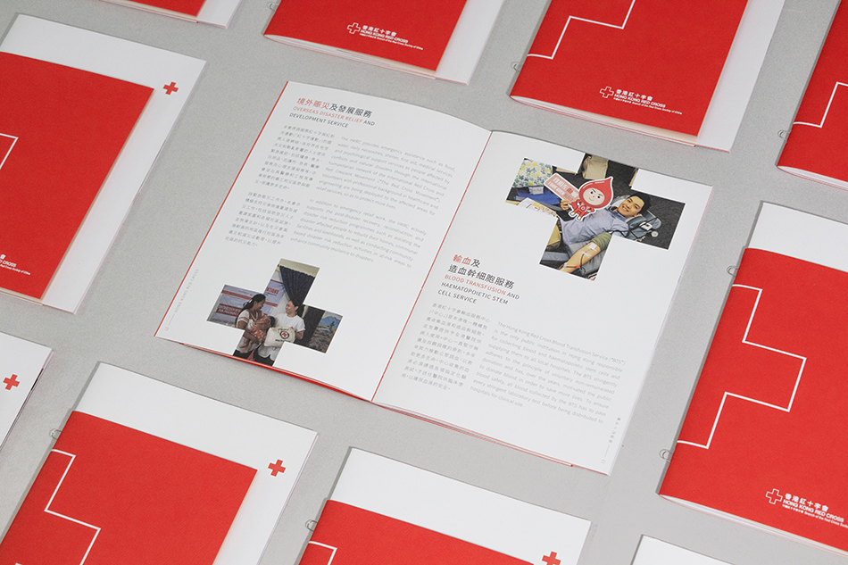
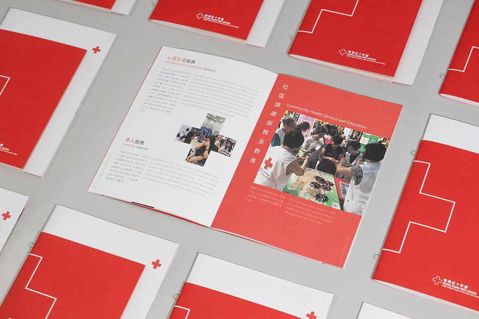
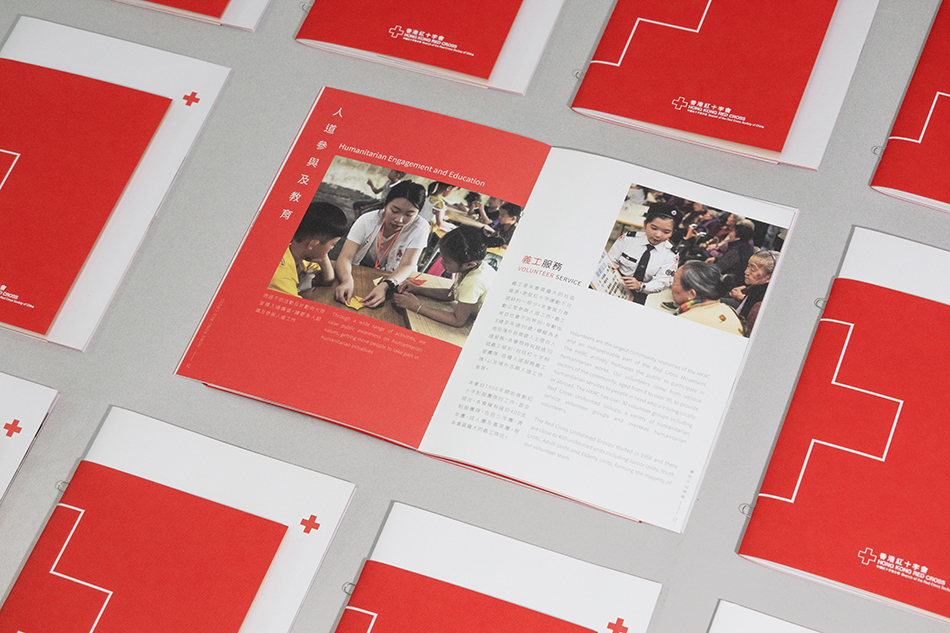
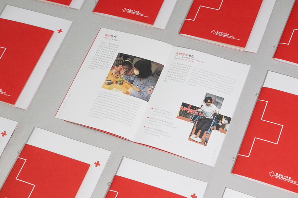
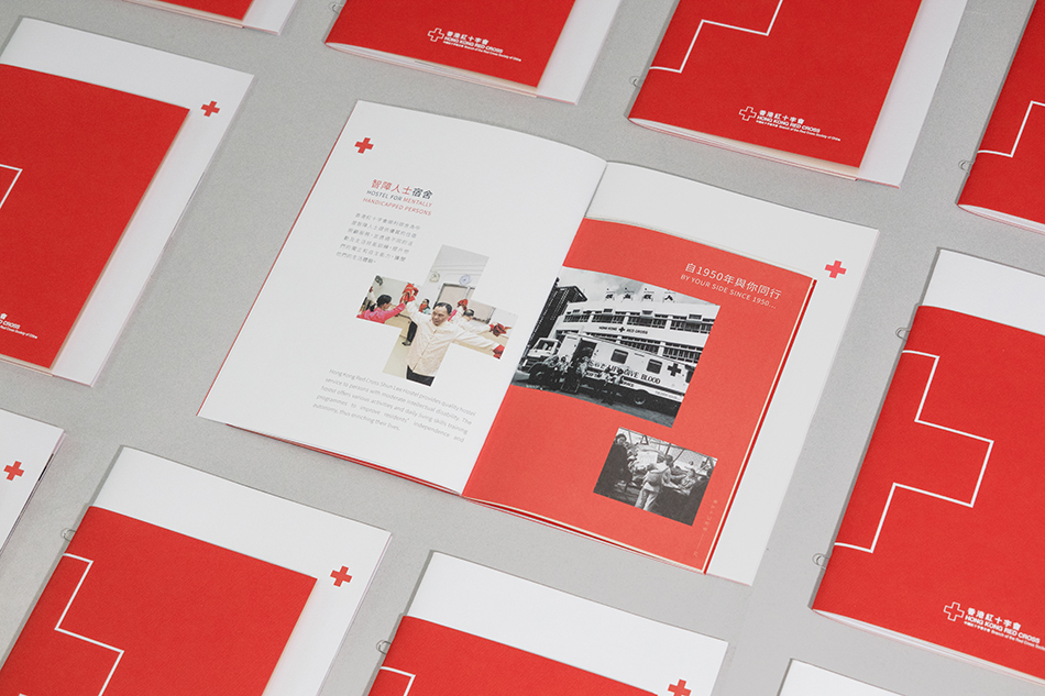
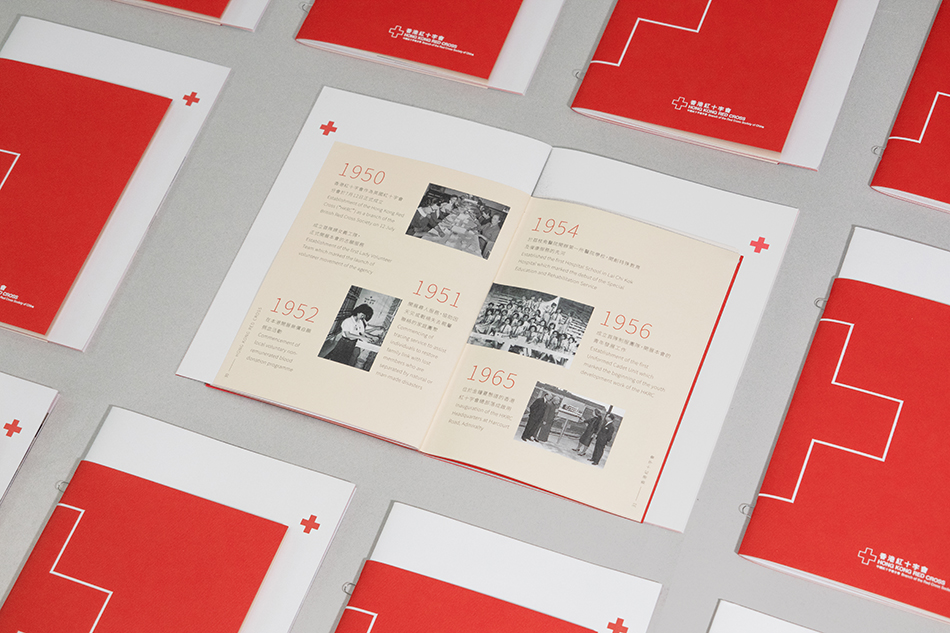
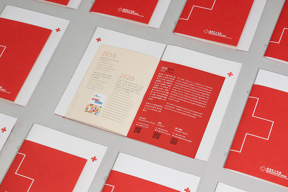
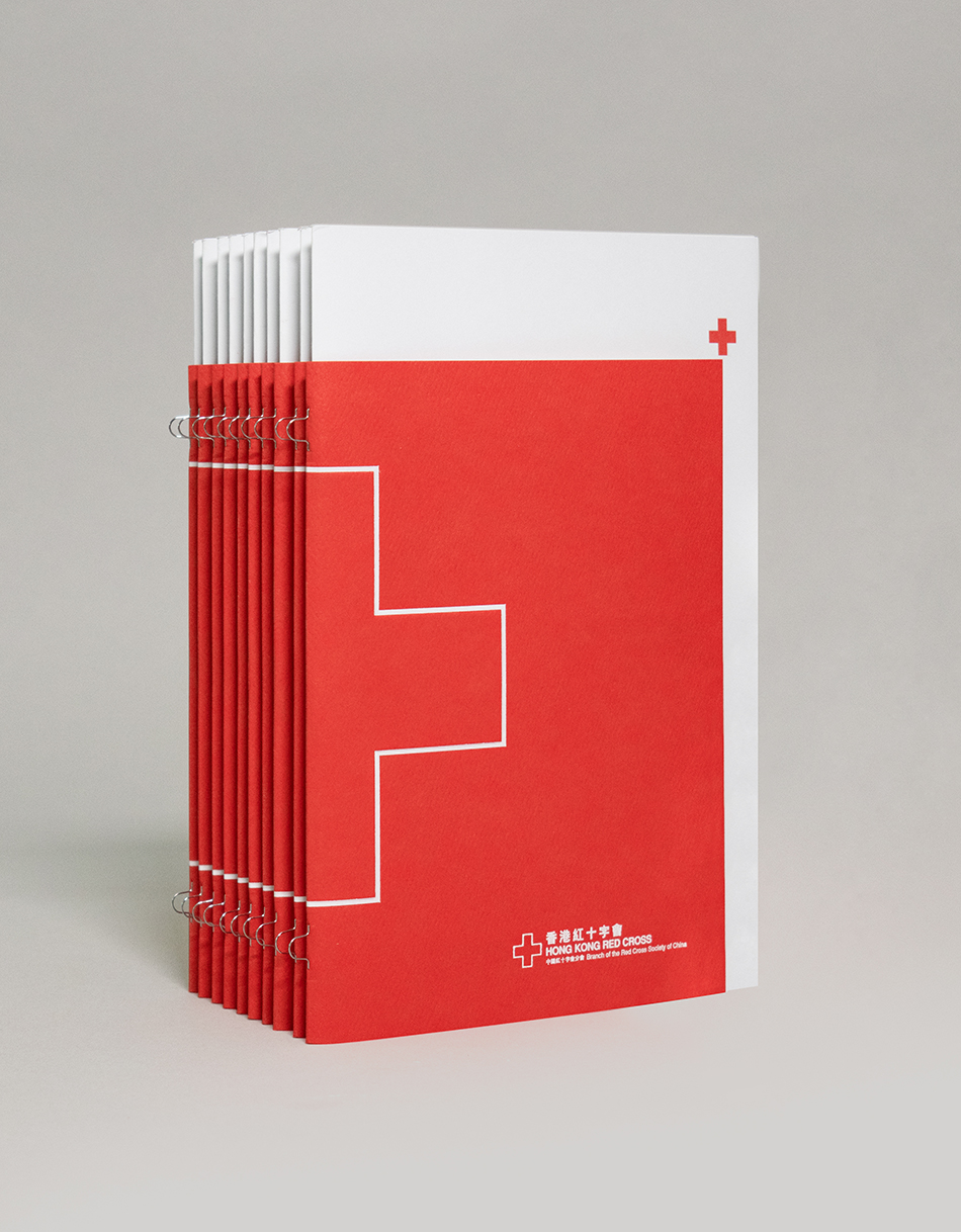
The booklet consists of two different sizes of pages. The small part, which is the introduce and ending, are the organisation's vision, mission, and history timeline; while the large part, the middle part, describes their different scope of services. We played around the contracting in between big and small, red and white. There's a big red cross logo on the book spine at the cover, and a small red cross logo on the top right corner of the cover. We used large proportion of red and white backgrounds, photos are framed in the large red cross logo shape in the inner pages. The red cover paper is a strong textured paper while the white inner pages are smooth papers. The embossing effect on the cover and the loop stitching crated a sense of touch to it. We wanted to create a minimal and sophisticated feeling to the booklet.
133
Hong Kong Red Cross
Corporate Brochure
[The balance of red and white]

Hong Kong Red Cross
Corporate Brochure
[The balance of red and white]