2014 |
[CLIENT] YVYRA PAYE |
Hong Kong |
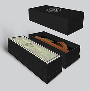
[CORPORATE IDENTITY] [PRODUCT DESIGN] [PACKAGING DESIGN] [LOGO DESIGN] [GRAPHIC DESIGN] [BROCHURE DESIGN] |
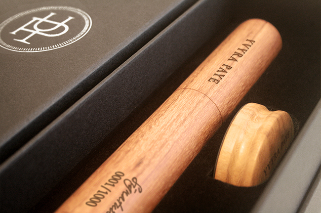
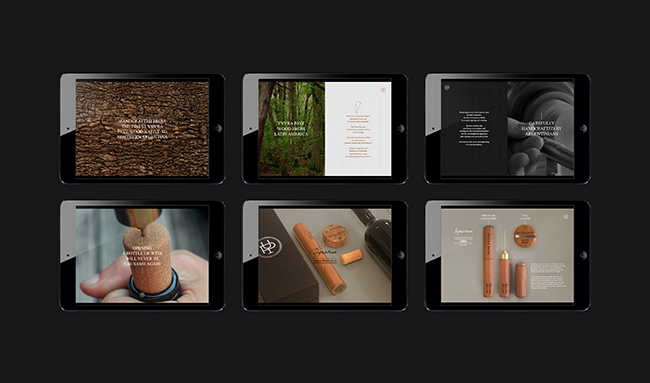
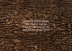
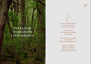
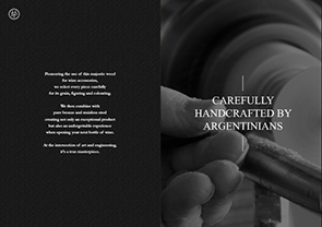
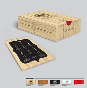
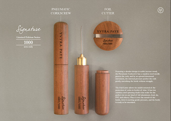
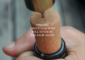
YVYRA PAYE is an Argentina company that makes luxury wine accessories from 100% national raw material resources. The products have been designed using the finest material of yayra paye wood, relating the wood texture to wine aging. YVYRA PAYE provides not only exceptional products but also an unforgettable experience when opening your next bottle of wine. At the intersection of art and engineering, it’s a true masterpiece. YVYRA PAYE is different from any wine accessories brand in the market. Targeting the premium and luxury sector, it creates a brand new . Pioneering the use of the majestic wood for wine accessories, YVYRA PAYE aims to introduce the world an attitude, a celebration to wine opening. This language is reinforced through visual references of familiar iconography, sharp lines and exquisite layout. Turning YVYRA PAYE to a contemporary and sophisticated realm.
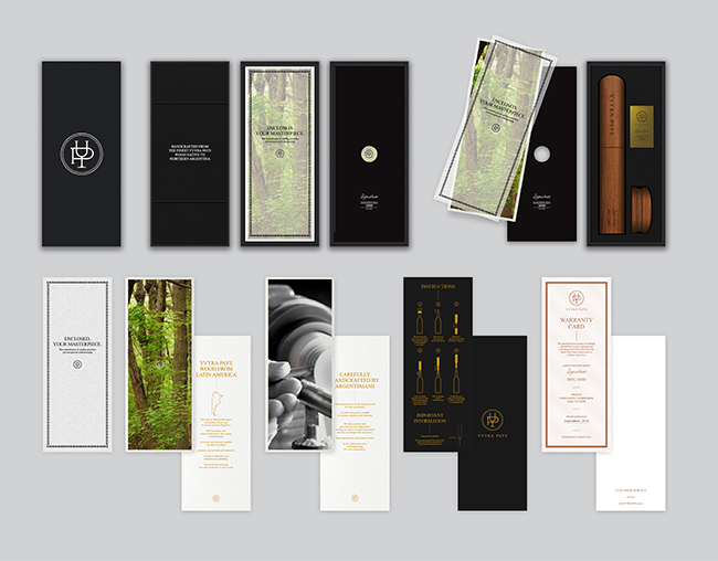
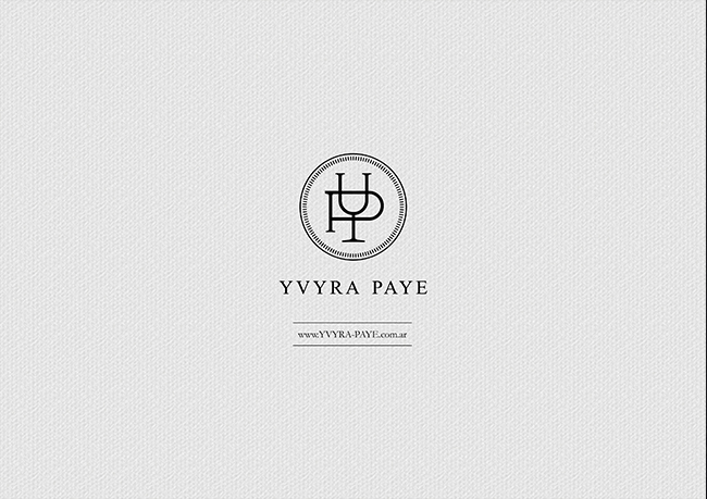
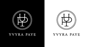
An elegance and precise brand feeling is created to project the prestige, exquisite and tradition image for YVYRA PAYE. Each part of the brand has been deeply thought through. It’s sophisticated, it’s an art. The brand identity is in black and white colour scheme that is to set off the products, the wood texture and the craftsmanship. The brand look and feel is to support the product and create a complete picture of the brand attitude. The logomark is designed in the form of a circle and the initial of the brand name, ‘Y’ and ‘P’. The letter ‘Y’ mimics a wine glass which relates the brand to wine and wine accessories. The letter ‘P’ goes across the letter ‘Y’ and created a water level in the wine glass. It symbolizes the opening of wine. The forms of both letters are taken the side view of the key product: pneumatic corkscrew. And the dashed circle represents the accuracy of the craftsmanship, adding a detail to the brand logo.
067
YVYRA PAYE
Branding
[Capturing the moment of wine-opening]

YVYRA PAYE
Branding
[Capturing the moment of wine-opening]