2021 |
[CLIENT] Santen |
Global |
[CORPORATE IDENTITY] [LOGO DESIGN] [BROCHURE DESIGN] [LAYOUT DESIGN] |


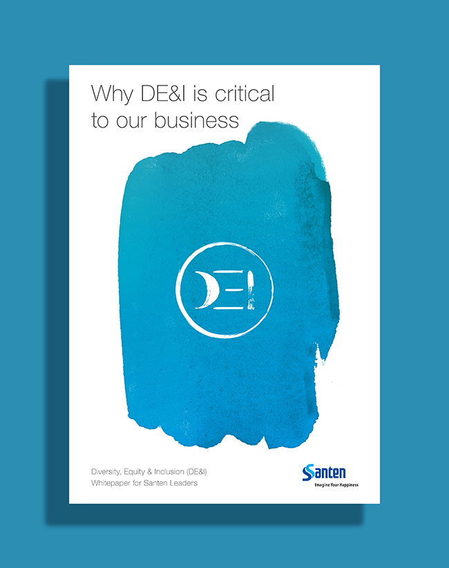
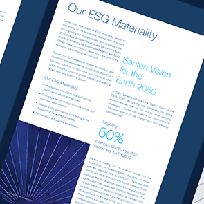
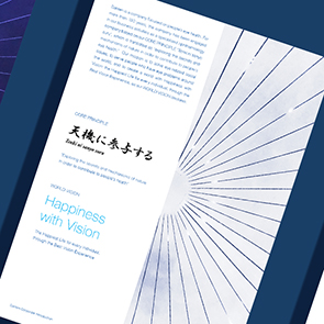
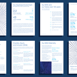
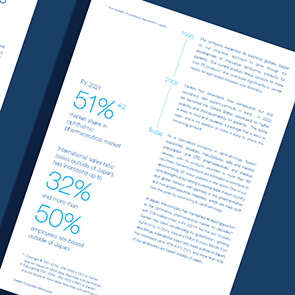
Santen is launching a new strategy internally on Diversity, Equality & Inclusion (DE&I) throughout their offices globally. We helped them to create a visual branding.
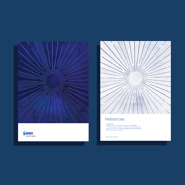
With a strong Japanese heritage, we created the logo in a calligraphy brushstroke style. The character "DEI" are simplified to the essentials, just like Japanese characters. We also created a green-to-blue gradient brand colour to give a modern feeling. For the key visual, we placed a splash of gradient watercolour in the center, just like Chinese and Japanese ink painting. It gives a spectacular and focus feeling, attracting people to pay attention this material.
143
Santen
DE&I Branding
[Modern x heritage]

Santen
DE&I Branding
[Modern x heritage]