2024 |
[CLIENT] The University of Hong Kong |
Hong Kong |
[BOOK DESIGN] [GRAPHIC DESIGN] [INFOGRAPHIC DESIGN] [WEBSITE DESIGN] |
[AWARDS]
Vision Awards Annual Report Competition, League of American Communications Professionals (LACP), 2023
|
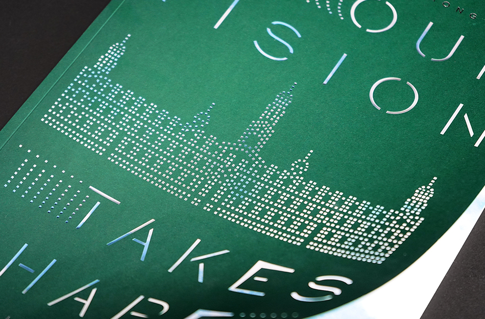
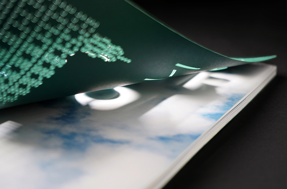
Based on the theme, "Our Vision Takes Shape", we used the motif of tiny pinpoints to symbolise the efforts of the many members and stakeholders of HKU coming together to realise a shared vision. The University's signature colour is a dark green, so using a clean, graphic style of green pinpoints against a white background throughout the publication reinforces the idea of collective effort and gives visual unity to the whole. On the cover, the pinpoints coalesce to form the iconic Main Building and the typography. They also literally allow the reader to "see the light" as the dots are in fact laser cut perforations that tempt the reader with glimpses of the next page, which is revealed to be a full-bleed visual of a bright, open sky. This image not only conveys a feeling of soaring optimism and hope, but also references the term "blue sky thinking" that is often used in academic circles as an invocation to keep pushing the boundaries of knowledge and learning.
179
The University of Hong Kong
Annual Report 2023-24 Design
[Looking into future through our lens]

The University of Hong Kong
Annual Report 2023-24 Design
[Looking into future through our lens]