2015 |
[CLIENT] Blueboard Interaction |
Global |
[CORPORATE IDENTITY] [LOGO DESIGN] [WEBSITE UX & UI DESIGN] [GRAPHIC DESIGN] [NAME CARD DESIGN] |
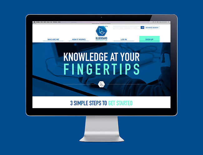
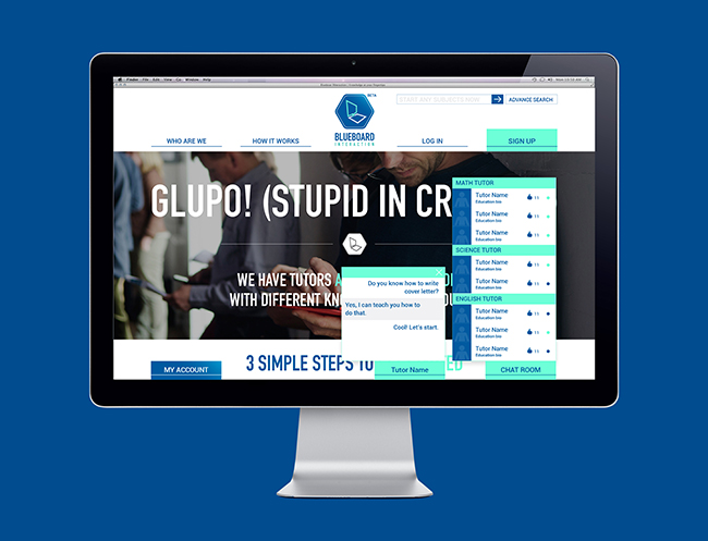
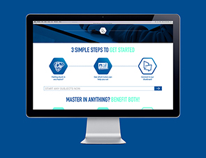
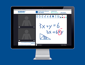
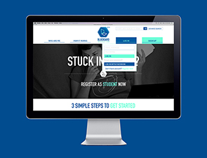
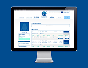
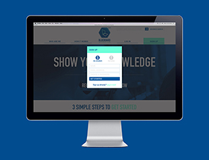
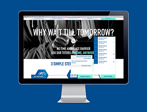
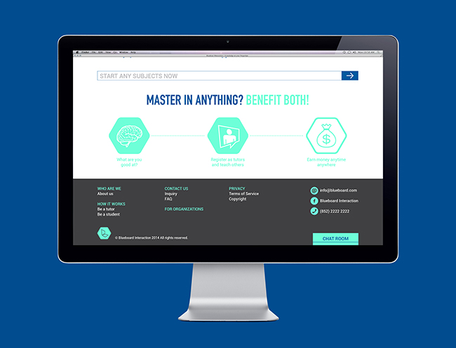
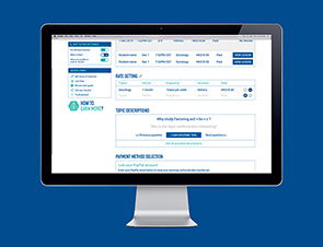
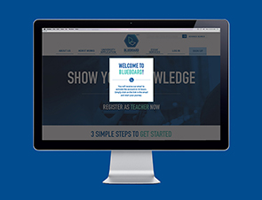
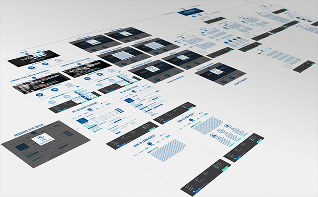
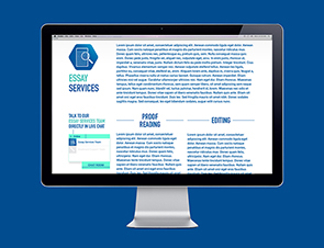
"Knowledge at the fingertips" Blueboard Interaction is a platform that connects tutors and students instantly, with lessons being conducted via our online ‘blackboard’.
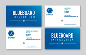
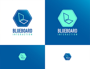
We designed the corporate identity together with the website design and user experiences. We chose a full blue colour as the primary colour to indicate the business as education related. We added a light blue gradient to give a more perspective feeling. We then touched up with a neon turquoise colour to give a fresh and modern feeling. The logo design consists of two slanted boxes that look like a laptop. It symbolise the high mobility of the brand. The top box is also a speech bubble which implies conversations platform. The two boxes are linked together and in a line form to give spaces for jumping out of the box and explore. It is an online platform to connect the world.
044
Blueboard Interaction
Branding
[Trustful yet playful]

Blueboard Interaction
Branding
[Trustful yet playful]