2022 |
[CLIENT] Nan Fung Group |
Hong Kong |
[CORPORATE IDENTITY] [LOGO DESIGN] [SPLASH SCREEN ANIMATION DESIGN] [IN-APP ILLUSTRATION DESIGN] [ICON DESIGN] [EMAIL TEMPLATE DESIGN] |
[AWARDS]
International Design Awards, 2023

|
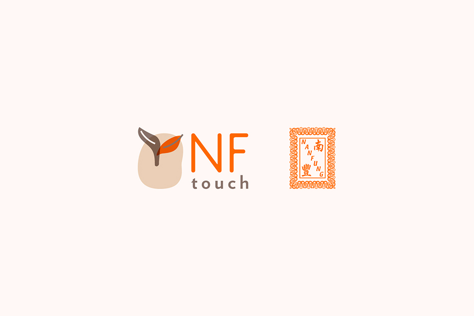
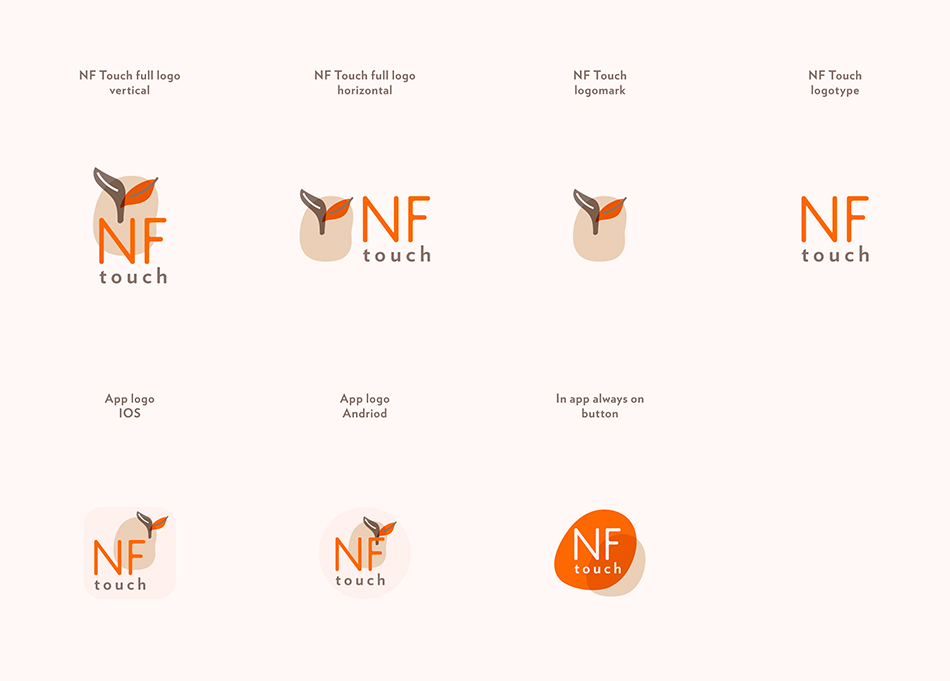
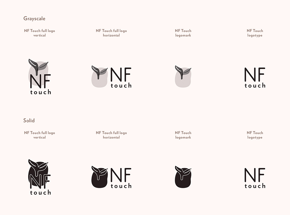
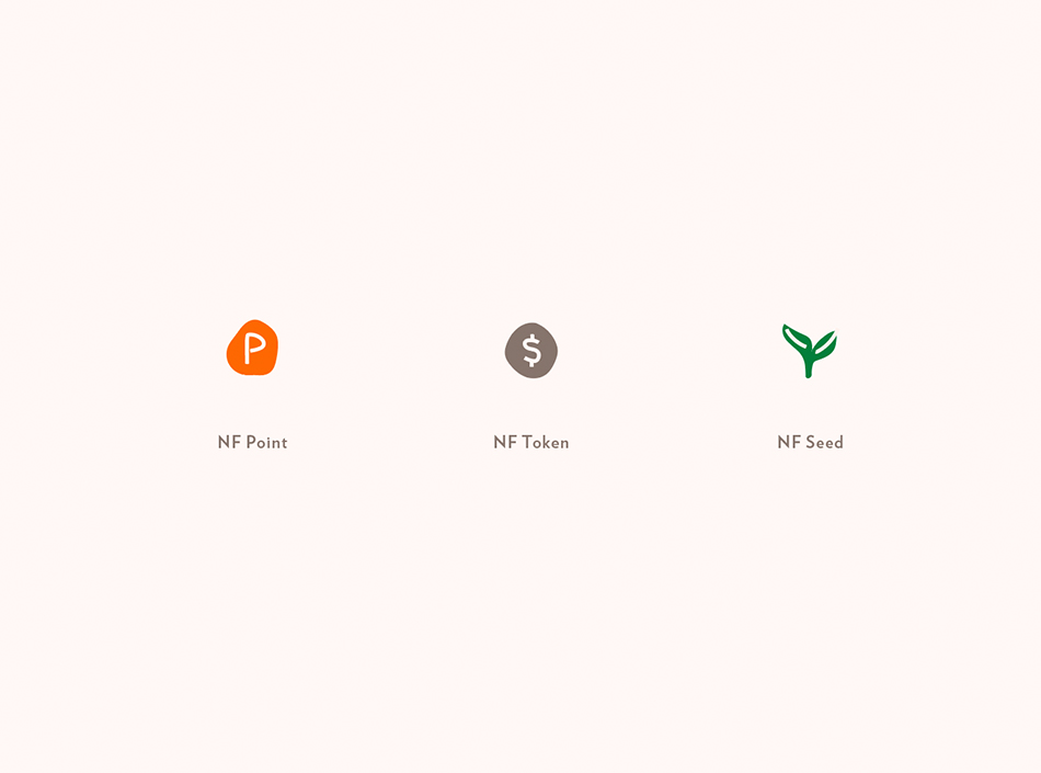
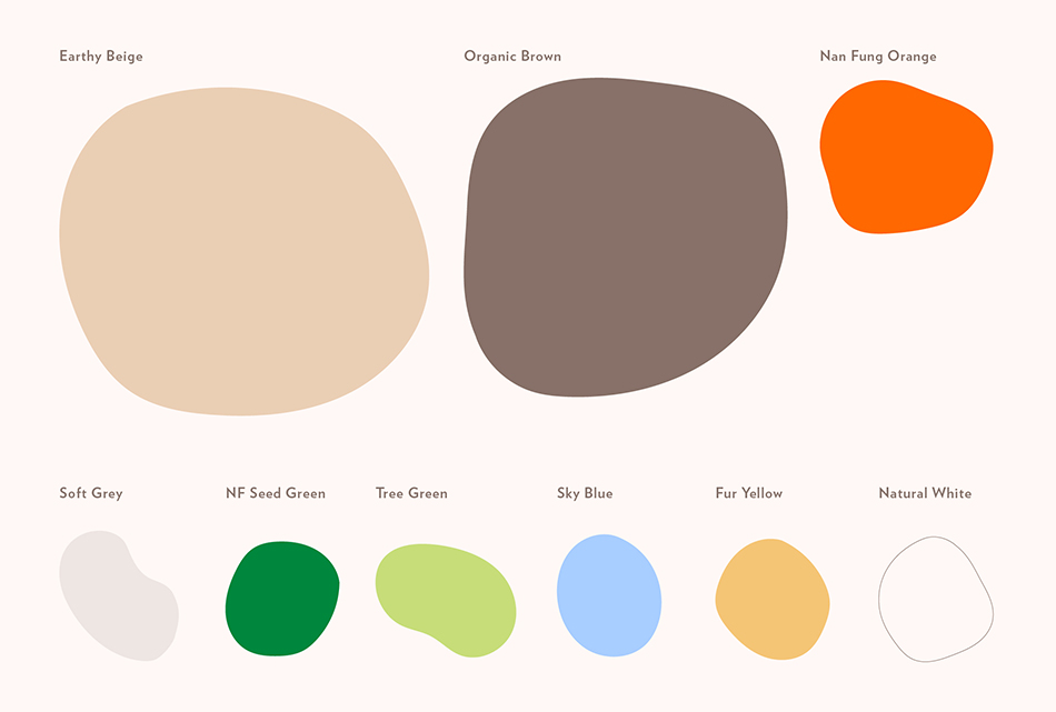
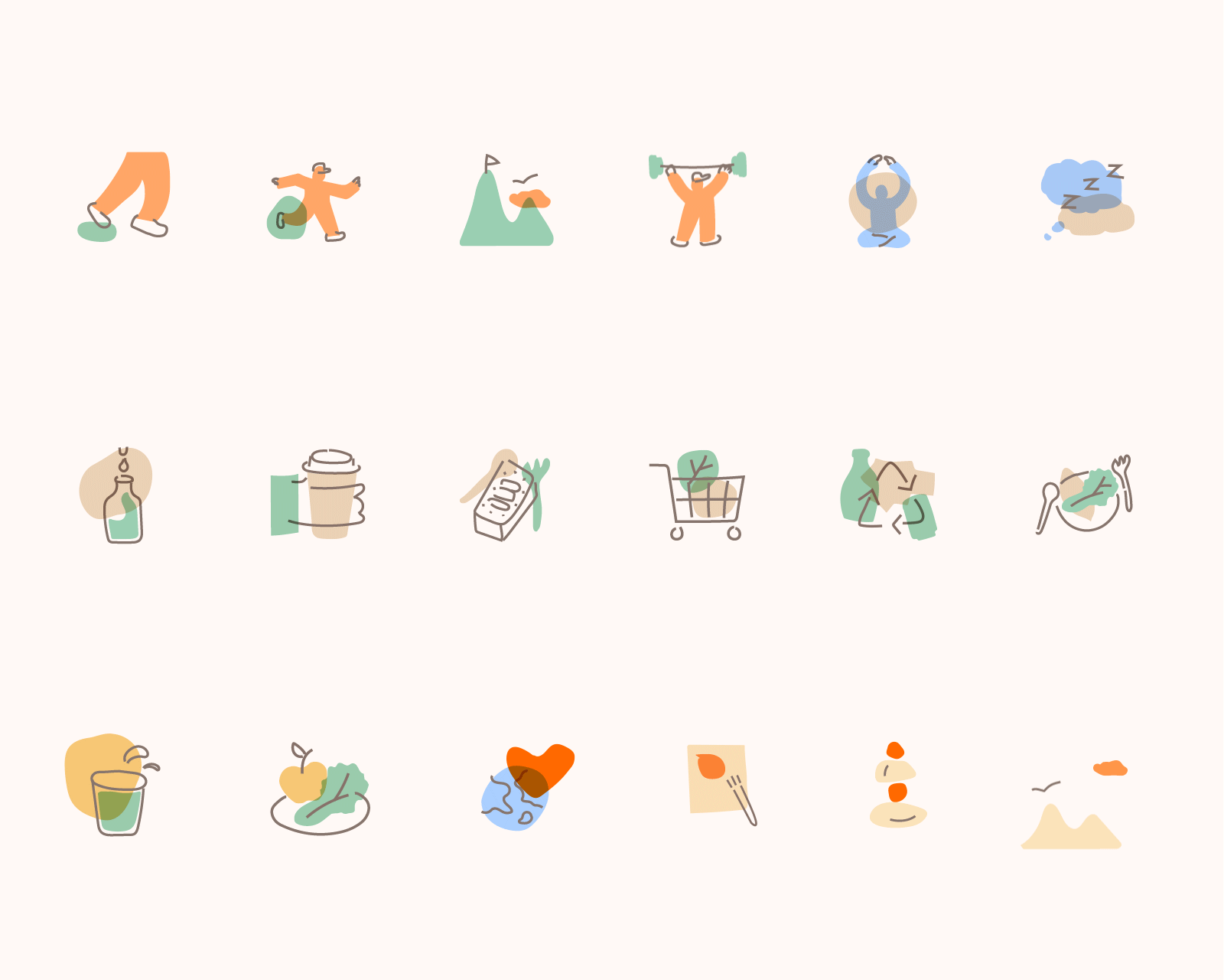
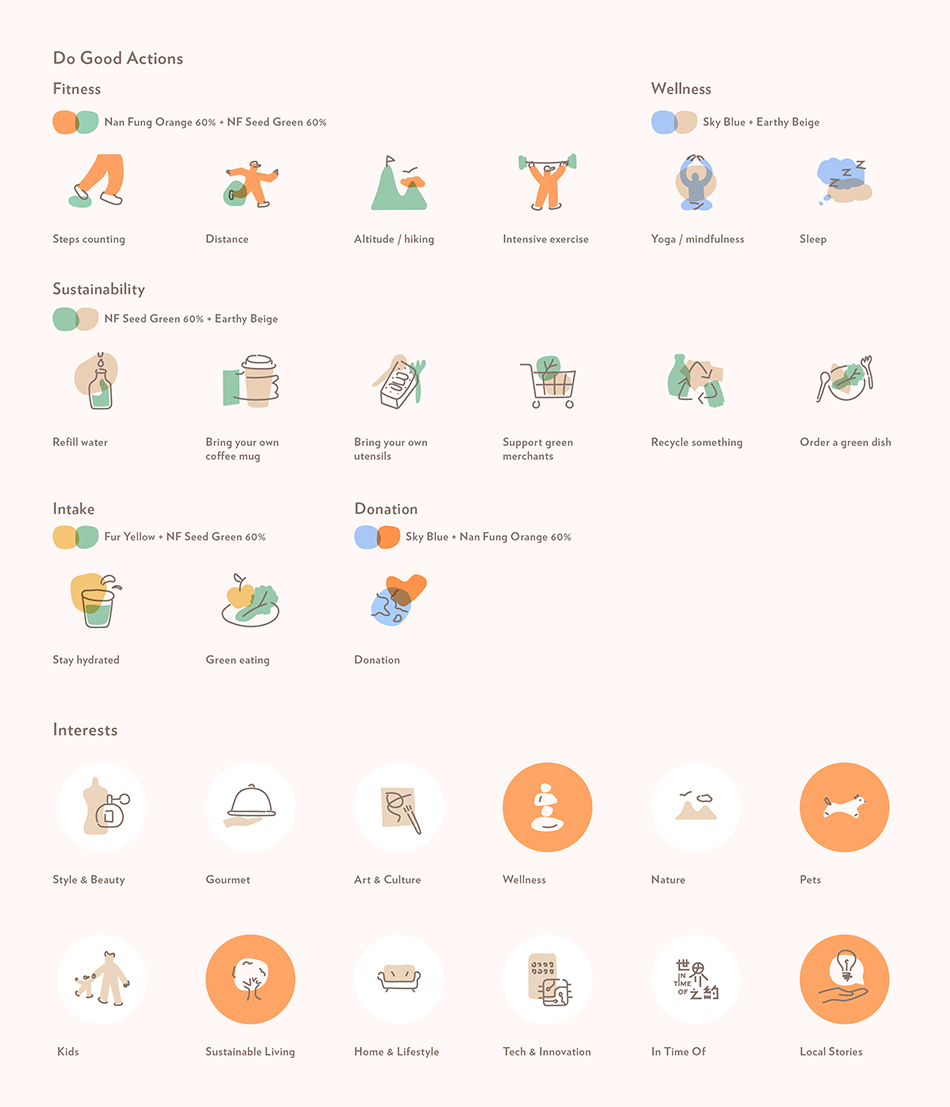
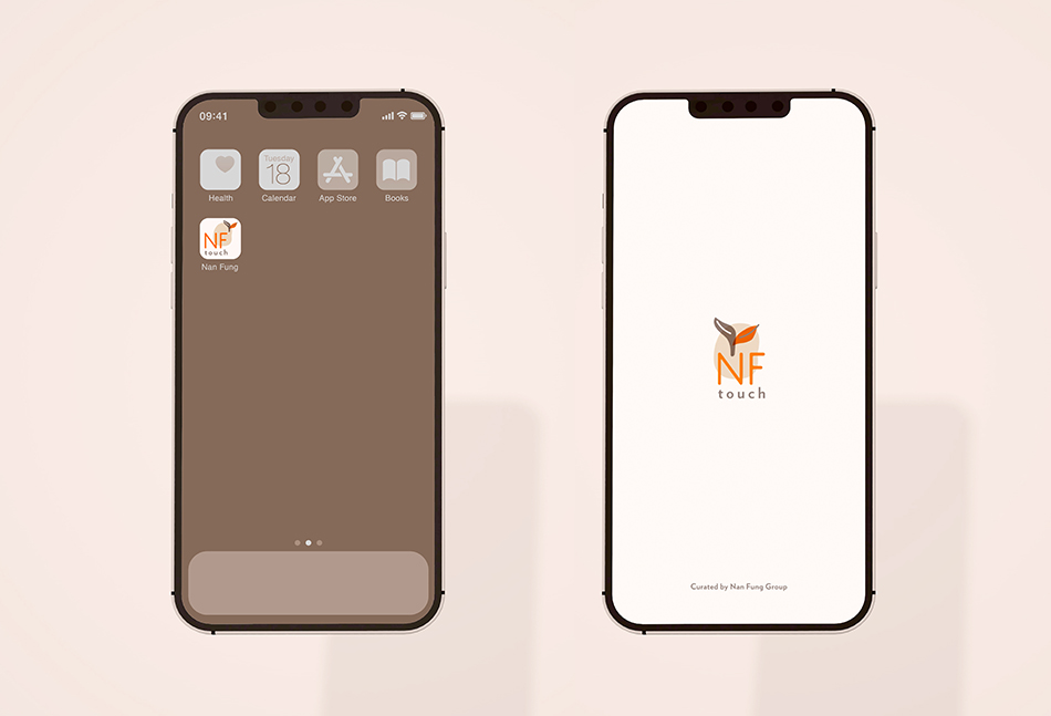
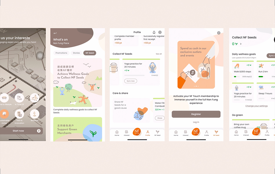
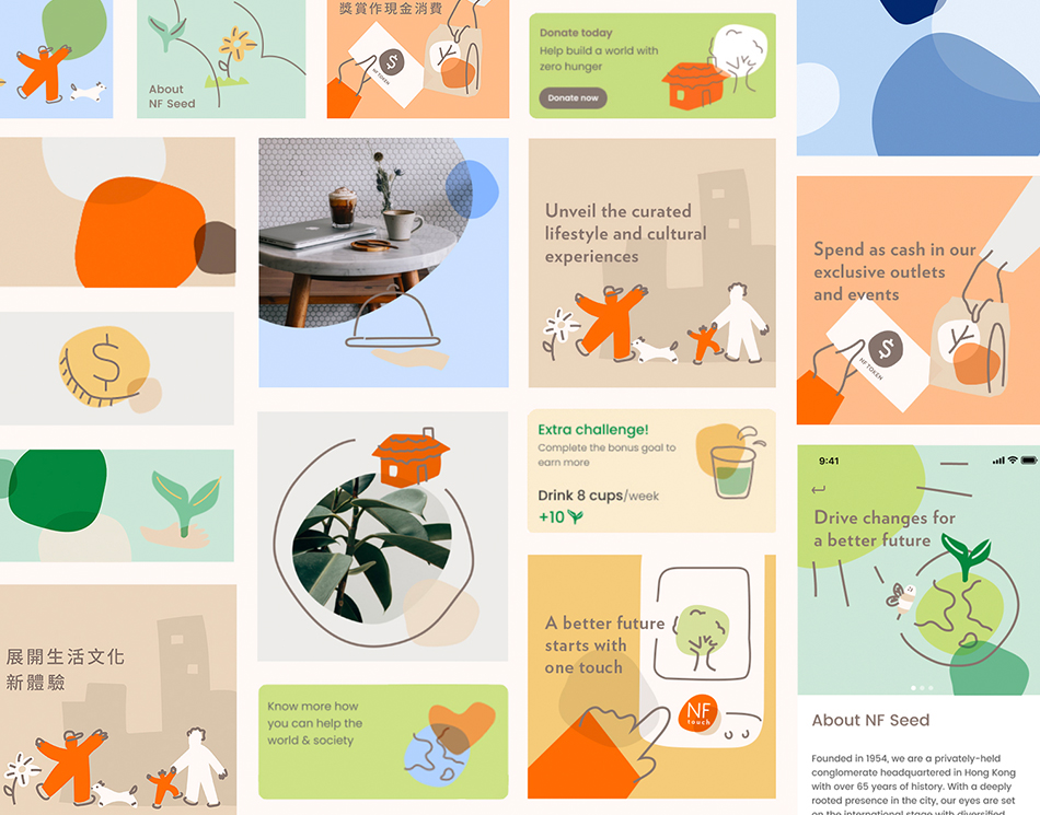
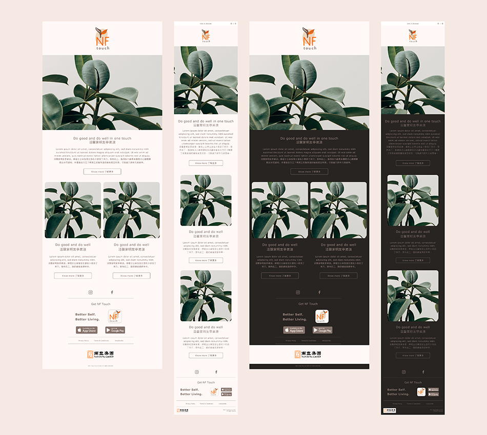
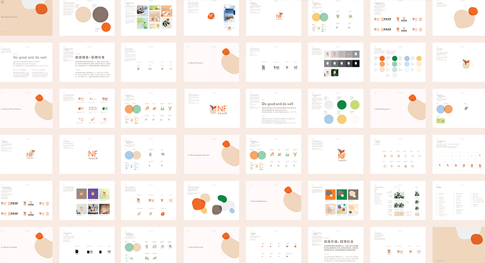
NF Touch is the city’s first membership app with a sustainable & community edge. Besides general points collecting through spending, doing good actions can earn NF Seed that can be donated to charity organisations to support the community. The overall concept in about touch and grow. It mimics the message of interacting with others and benefiting our neighbourhood. Touch involves at least two different parties. It is organic and sensual. Overlapping organic shapes visualises the touch of interactions. The logo design symbolised do good and do well to ourselves, neighbours, community and the planet. The forms are overlapping each other representing the touch and connection between them. The brand colour palette is inspired from nature and our surrounding. For icons and graphic style, organic shapes with freestyle line drawing are best to express the softness and lifestyle brand feeling.
170
Nan Fung Group NF Touch
Branding
[Touch to grow a seed]

Nan Fung Group NF Touch
Branding
[Touch to grow a seed]