2021 |
[CLIENT] Rixon Frost |
Global |
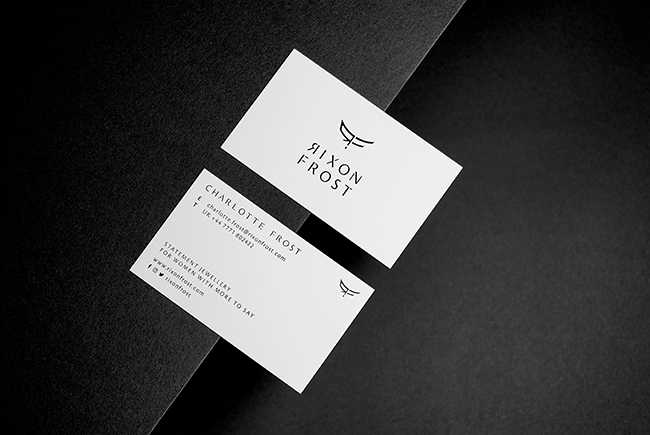
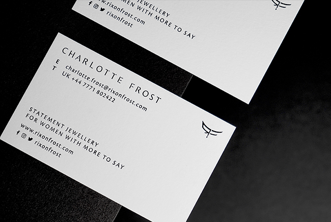
[CORPORATE IDENTITY] [LOGO DESIGN] [BRANDING GUIDELINES] [NAME CARD DESIGN] [PACKAGING DESIGN] [WEBSITE UX & UI DESIGN] [ONLINE OFFLINE MATERIALS] |
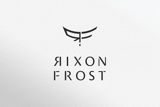
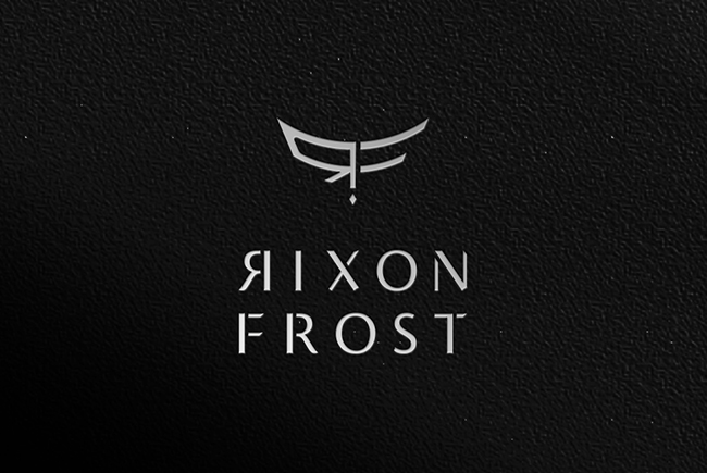
Rixon Frost produces futuristic fine jewellery for feminist warriors! It is a high-end avant garde style jewellery brand.
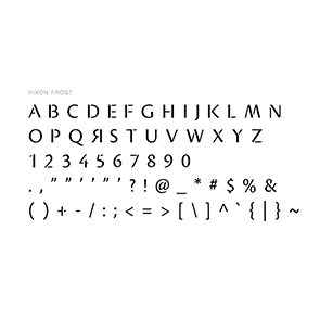
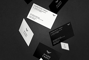
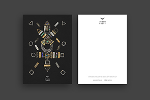
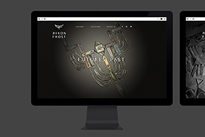
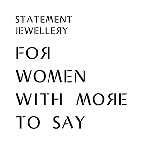
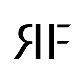
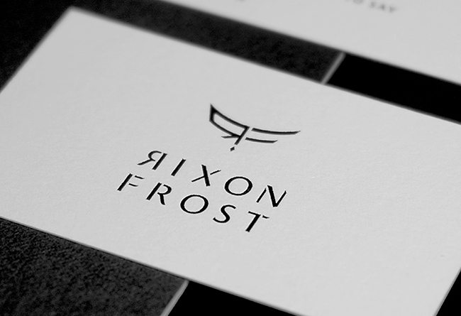
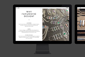
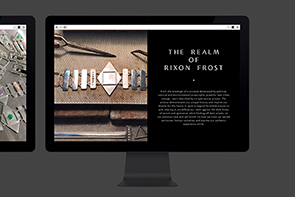
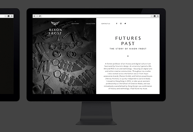
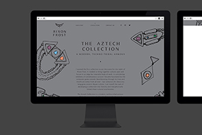
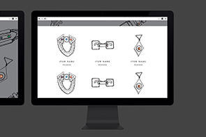
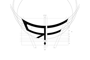
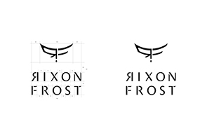
We helped on the visual identity of the brand. The whole brand should give a feeling of bold, strong yet elegant, and fashionable feeling. For the logo design, we played around with the initial, "R" and "F" to great a sealmark. It is like a wing which represent freedom. The little rhombus in the bottom creates a grounding, giving the logo delicacy. We've also tailor made a set of typography for the brand font. All the capital "R" of the font is horizontally reversed, just like the logo treatment, symbolising the reflection of gender stereotype. There are disconnected details between strokes and joints, and with sharp slanted edges, symbolising the tribal and futuristic element of the jewellery design. The typography has the elegancy of a serif font. We wanted to capture the boldness and yet maintain the luxury feeling. For the colour scheme, we are using the largest contrasting colour, black and white. It goes through different collaterals of the brand. We also designed the website. By using a clean and edgeless layout, audiences are able to see the jewelry and the designer sketches clearly.
107
Rixon Frost
Branding
[Freedom of feminism]

Rixon Frost
Branding
[Freedom of feminism]