2015 |
[CLIENT] Arts Future Projects, City University of Hong Kong, School of Creative Media |
Global |
[CORPORATE IDENTITY] [GRAPHIC DESIGN] [LOGO DESIGN] [WEBSITE UI & UX DESIGN] [WEBSITE PROGRAMMING] [STATIONERY DESIGN] [BRANDING GUIDELINES] |
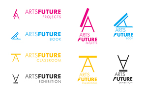
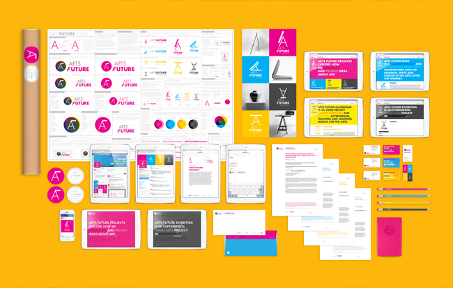
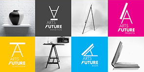
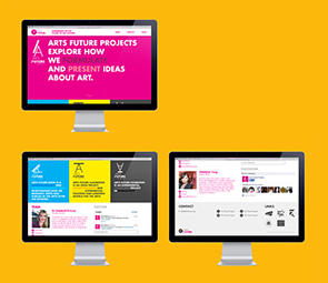
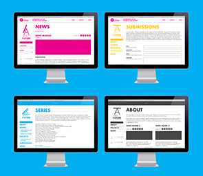
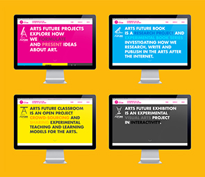
Arts Future Projects is an organization on exploring how we formulate and present ideas about art, areas include art history, books and education. Therefore it contains several sub-brands underneath: Arts Future Book, Arts Future Classroom and Arts Future Exhibition. Arts Future Projects has an online platform that can gather ideas and information from all different art related people. The website includes research project and experimental book series investigating how we research, write and publish in the arts. There is also an open project crowd-sourcing and sharing experimental teaching and learning models for the arts. It aims to create a networking space for all art related people. It’s like a resources site.
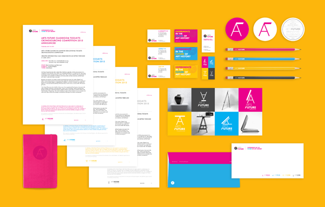
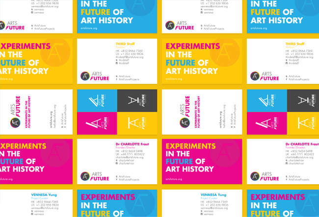
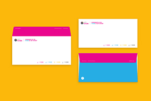
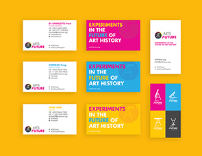
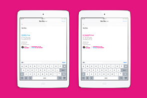
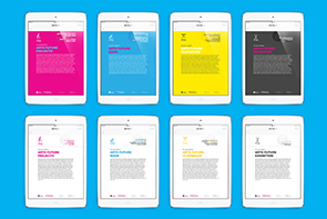
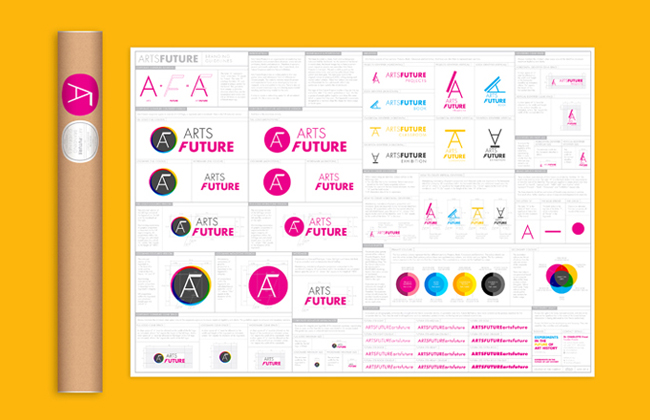
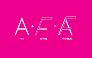
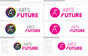
We hope to create a clean, fresh and contemporary look and feel for the brand. As the content of the brand is mostly data, the brand image has to have a certain visual impact so people can remember Arts Future Projects in first sight. We pick a striking pink as the primary colour tone, and pairing with a bright blue, yellow and dark grey. The idea goes back to the original colours in printing (CMYK), a long lasting and neutral colour scheme. These four colours are also used as differentiate the four sub-brands that help audiences to learn quickly the whole brand. The logo of Arts Future Projects implies a flag (on the top end of the letter "F"), which symbolizes a "say". It's like a group of people gather together and share the same belief, a space that they own. The letter 'A" and "F" create a primitive structure where they can be deconstruct and create new 2D or 3D forms to represent different meanings. The logomark is purposely designed as a rounded chop like shape for future usage on book spine.
058
Arts Future Projects
Branding
[Alphabet as tool]

Arts Future Projects
Branding
[Alphabet as tool]