2020 |
[CLIENT] Tide, Grey |
China |
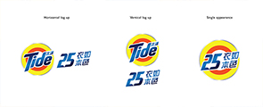
[CORPORATE IDENTITY] [LOGO DESIGN] [KEY VISUAL DESIGN] [GRAPHIC DESIGN] [ANIMATION] [ANIMATION] [LAYOUT DESIGN] |
Tide is turning to their 25th anniversary in 2020 in China and we helped to develop the branding elements for them.
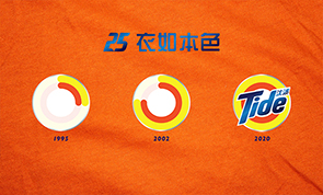
While brainstormed a lot of different ideas, the final one is inspired by the circular motions when clothes are being washed in washing machine, which also share the same form visually with the Tide Bull's Eye in their logo. The cyclical motion can also represent the fashion trends / cycles that Tide has been going through with people over the years.
We adapted a clockwise spinning effect to the logo. The orange and yellow circles in Tide's logo gradually grow and formed, indicating the 25 years of washing and protecting fabric's original colours.
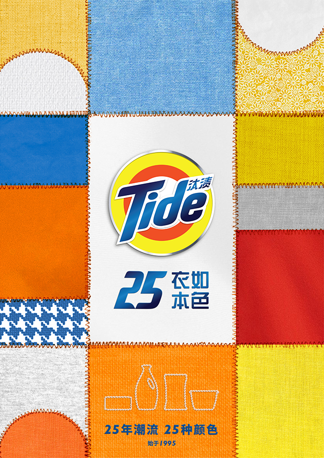
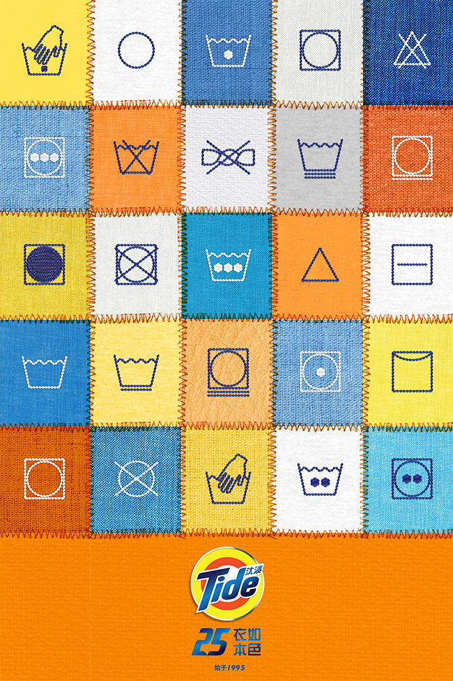
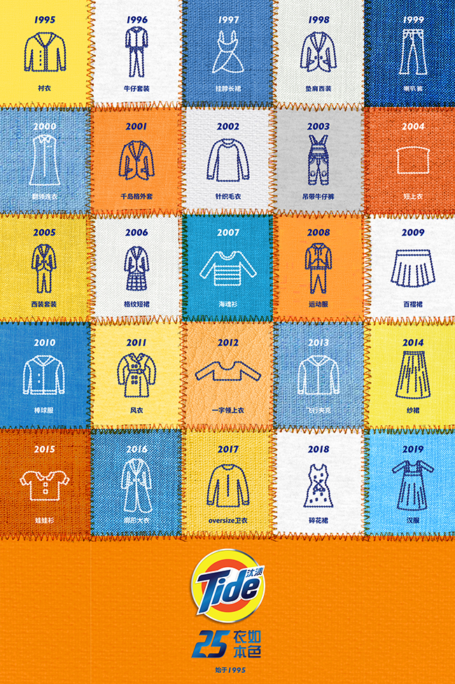
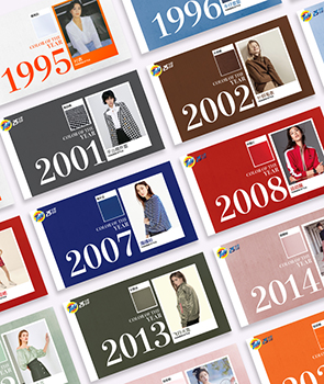
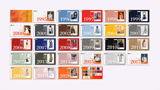
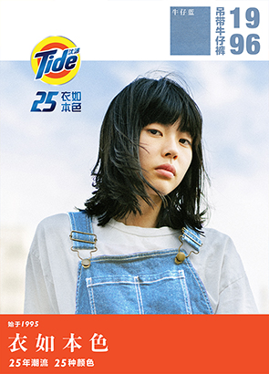
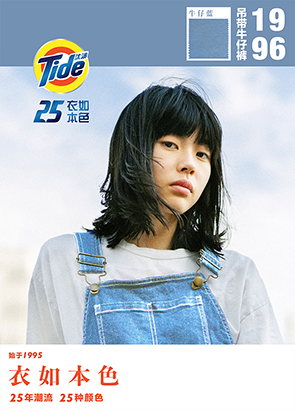
For the key visual, we have created a patchwork of different fabrics sawing together, representing different fashion trends and different clothes. And Tide has been protecting them throughout the years. There are another two icon key visuals in playing around with the washing symbols and the fashion trends icons. A brand book is created to indicate the 25 specific fashion trends for each year. There is also a model key visual template designed for further adaptation.
Three 5 secs vertical promotional gif were also created for social media blasting. They are with different topics introducing Tide in three ways: product milestones, garment colours and fashion trends.
132
Tide 25th Anniversary
Branding
[Spinning from the origin]

Tide 25th Anniversary
Branding
[Spinning from the origin]