2022 |
[CLIENT] Hong Tai Wan Jai |
China |
[LOGO DESIGN] [TYPOGRAPHY DESIGN] |
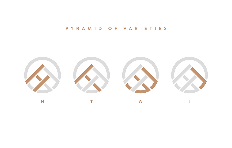
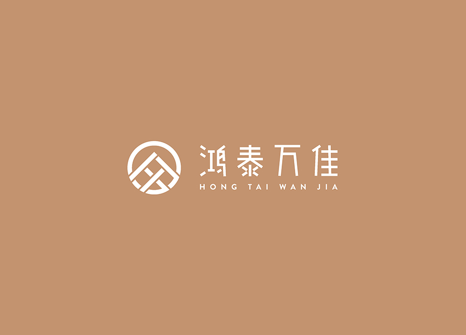
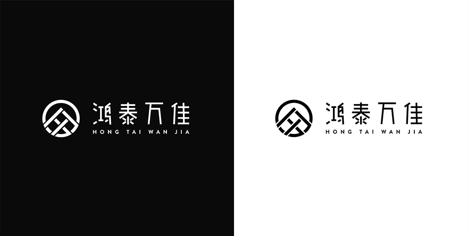
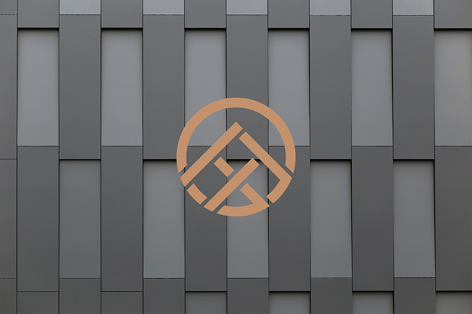
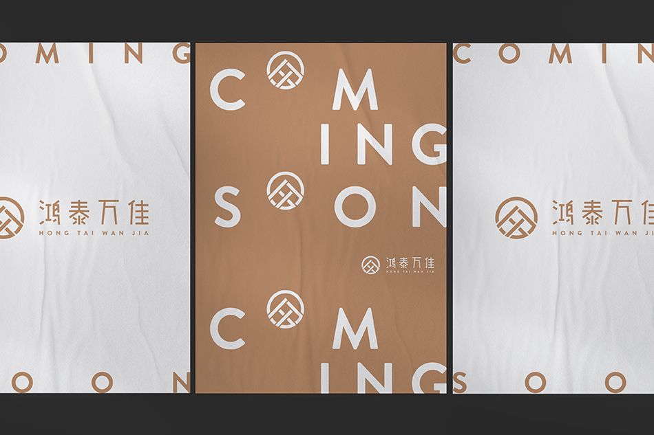
Hong Tai Wan Jia 鴻泰萬佳 is a shopping mall in China. Wan Jia, "萬佳", means of excellence of many. We developed the logo design in the shape of a pyramid, symbolising the varieties of goods. The pyramid is formed by the four initials, "H", "T", "W" and "J", creating a uniqueness of the brand. The whole logo is in the form of a circle which represents all inclusive and all rounded. The bronze and white brand colours reflected a luxury and premium feeling. The Chinese typography treatment gives a modern and interesting element to the brand.
169
Hong Tai Wan Jai Shopping Mall
Logo Design
[Pyramid of varieties]

Hong Tai Wan Jai Shopping Mall
Logo Design
[Pyramid of varieties]