2020 |
[CLIENT] Home is Beneath the Lion Rock |
Global |
[CORPORATE IDENTITY] [LOGO DESIGN] [BRANDING GUIDELINES] [WEBSITE UI & UX DESIGN] [WEBSITE PROGRAMMING] |
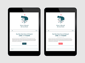
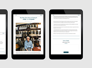
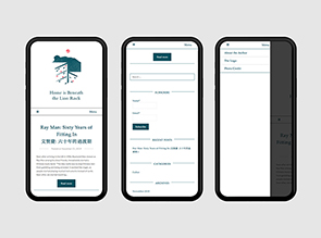
Home is Beneath the Lion Rock is a blog that covers stories of Hong Kong people who have migrant to other places. It provides a data base of different perspective towards migration. The blog remains in neutral, hoping the readers can digest the stories and make judges on their own.
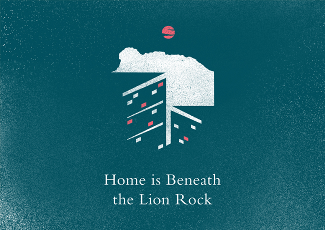
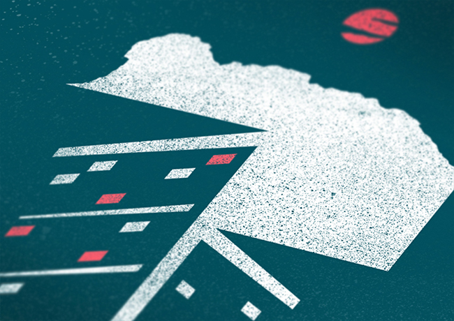
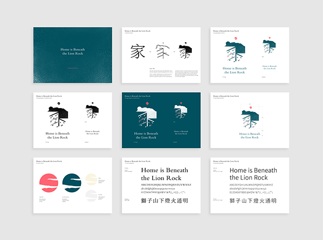
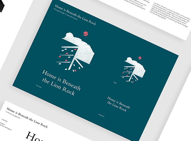
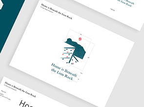
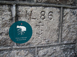
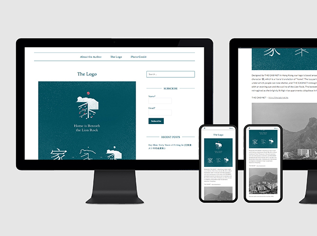
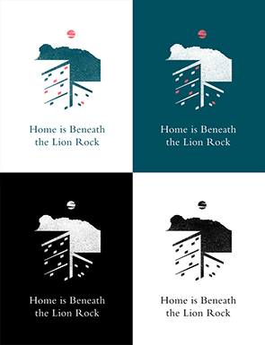
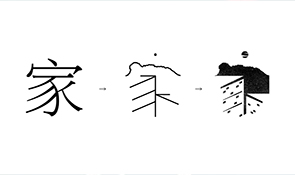
We helped to create the visual branding. The idea is inspired by the Chinese word “家 (home)”. This word was originally created by pictograph version of home. There’s a shelter underneath the sun where human and poultry can live inside it. Based on this structure, we wanted to visually demonstrate this idea incorporating the Lion Rock. The dot is a sunset, the shelter is the Lion Rock and the bottom part is in geometric line shape which they look like residential buildings. There are some shades of lights inside the buildings to create a prosperous scene. Each lights symbolised one household, giving the message of unity and stay together.
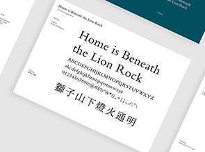
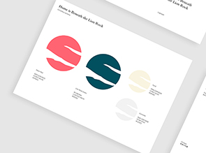
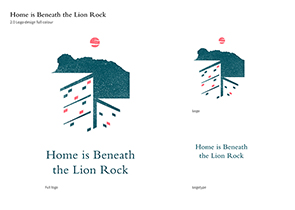
For the colour tone, we take reference of the sunset view and the Lion Rock colour to create a neutral colour tone out of any political backgrounds. The typography created an elegant feeling to let readers to take time and read the blog.
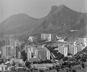
Slab block public estates beneath the Lion Rock in 1980s.
121
Home is Beneath the Lion Rock
Branding
[The modern pictograph]

Home is Beneath the Lion Rock
Branding
[The modern pictograph]