2016 |
[CLIENT] DNA WeCheck |
Hong Kong |
[CORPORATE IDENTITY] [LOGO DESIGN] [STATIONERY DESIGN] |
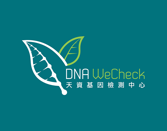
DNA WeCheck is a laboratory center that offers DNA checking for kids. To better know what type of your children are, you can know how to nurture your next generation correctly.
We helped to create the brand identity for them. We used growing leaves to represent generations and family tree. The leaves has a DNA pattern embeded into the leave, mimicking what you are are based on your DNA in your blood, from your ancestors. We used a teal colour to give a professional feeling and a little light green to give a fresh and new feeling.
042
DNA WeCheck Branding
[The origin of nature]

DNA WeCheck Branding
[The origin of nature]